Using the Select Control - JS: Difference between revisions
| (2 intermediate revisions by the same user not shown) | |||
| Line 13: | Line 13: | ||
* Start App Studio from the Start menu. | * Start App Studio from the Start menu. | ||
* At the initial screen select New Project dialog box, with the following settings: | * At the initial screen select New Project dialog box, with the following settings: | ||
*# Form factor should be iPhone/iPad/Nexus | *# Form factor should be iPhone/iPad/Nexus | ||
*# Name is Select control.nsx | *# Name is Select control.nsx | ||
| Line 56: | Line 55: | ||
} | } | ||
function Main(){ | |||
selWeekDay.clear(); | selWeekDay.clear(); | ||
for (i=0; i <= 6; i++) { | for (i=0; i <= 6; i++) { | ||
selWeekDay.addItem(WeekdayName(i+1)); | selWeekDay.addItem(WeekdayName(i+1)); | ||
} | } | ||
} | |||
</pre> | </pre> | ||
| Line 100: | Line 99: | ||
Once again, press F5 to start the program. | Once again, press F5 to start the program. | ||
[[File:TT04.06. | [[File:TT04.06.png]]<br> | ||
== Additional Properties, Methods, and Events == | == Additional Properties, Methods, and Events == | ||
Latest revision as of 09:06, 20 January 2015
Introduction
The purpose of this tutorial is to demonstrate how to add a Select control to a form using AppStudio. You should have completed the A Simple Program tutorial before beginning this tutorial.
The program to be developed will start out creating a form with a Select control. It will then show how to populate the Select control and detecting when the user has selected a value from the list.
Creating a Select control
Creating the Form
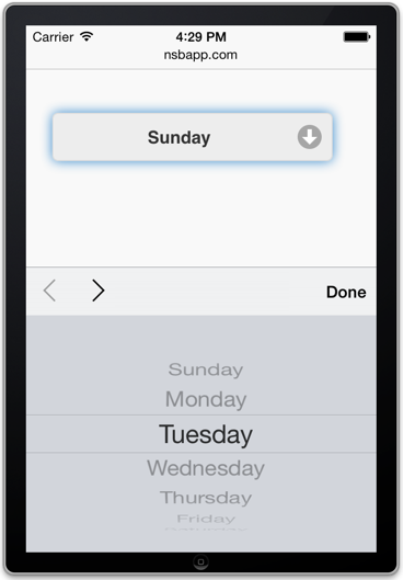
A Select control is really a combination text box and list box. Items in the list can be added and removed or selected by the user. The Select control looks like a single line text box until the user clicks on the box causing a drop-down list to appear. The user can select one of the items in the list or enter a new value. Events are generated whenever an item is selected or changed.
- Start App Studio from the Start menu.
- At the initial screen select New Project dialog box, with the following settings:
- Form factor should be iPhone/iPad/Nexus
- Name is Select control.nsx
- Language is JavaScript
Add a Select control to the form:
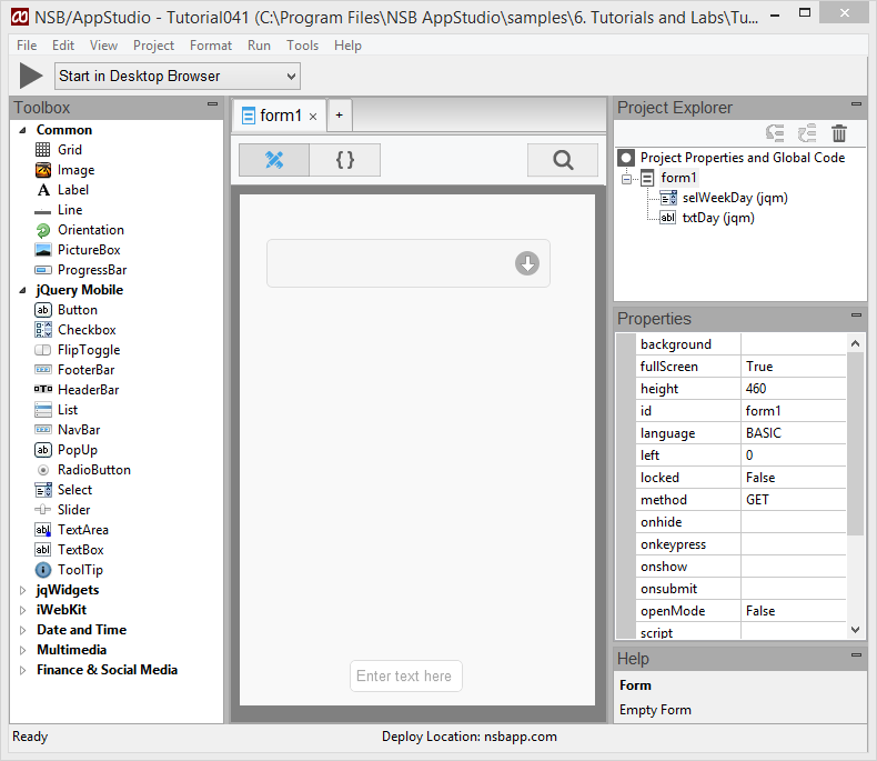
- Drag a Select control object from the Toolbox to the Design Screen.
- The object is automatically selected as indicated by its red border.
- Set the ID in the Properties window to "selWeekDay". The Combo Box will display as selWeekDay in the Project Explorer window.
- Set the WIDTH in the Properties window to 250 (alternatively, the width can be modified by dragging the left or right border edge horizontally)
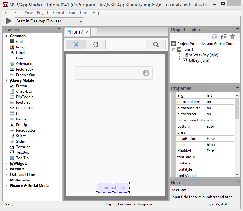
- Drag a TextBox object from the Toolbox to the Design Screen.
- The TextBox will appear on your form as a rectangle with the default text 'Enter text here'.
- The object is automatically selected as indicated by its red border.
- Set the ID in the Properties window to "txtDay". The Text object will display as txtDay in the Project Explorer window.
- Scroll down in the Properties window and click on 'Readonly' and select the read only option.
- Also in the Properties window, find placeholder and remove the default text (Enter text here)
Creating the Code
We need to add code to initialize the Select control with items for the user to select.
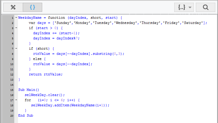
In the Project Explorer window, click on 'Code' below the Form1 entry. This is where we will place our initialization code
WeekdayName = function (dayIndex, short, start) {
     var days = ['Sunday','Monday','Tuesday','Wednesday','Thursday','Friday','Saturday'];
     if (start > 0) {
       dayIndex += (start-1);
       dayIndex = dayIndex%7;
     }
     if (short) {
       rtnValue = days[--dayIndex].substring(0,3);
     } else {
       rtnValue = days[--dayIndex];
     }
     return rtnValue;
}

function Main(){
   selWeekDay.clear();
   for   (i=0; i <= 6; i++) {
      selWeekDay.addItem(WeekdayName(i+1));
   }
}
- The For...Next loop initializes the Select control with the days of the week by cycling through each weekday name (index 0 thru 6).
- WeekDayName is a function where index 0 = Sunday, index 1 = Monday, etc. By looping through index 0 through 6 we add each day of the week to the Select control object.
- Sub Main() is called once all the controls are rendered on the screen. We can then add items to the Select control.
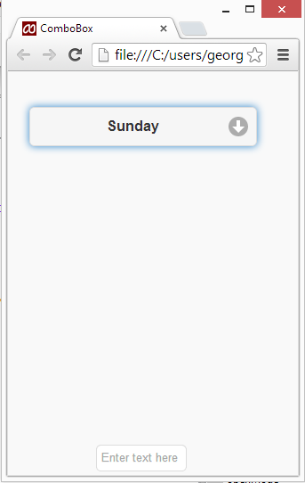
Testing the Program
There are several ways to test the program in a suitable browser.
- Press F5 to save and start the program.
- Select RUN, Start in Desktop Browser
- Click the Right Arrow button on the toolbar.
Using the Select control
The Select control program we just built allows the user to click on the list and select a day of the week but does nothing with the selection. Let's modify our code to detect when the user has clicked on the box and display the selection in the Text Box we created named txtDay.
Extending the Code
- In the Project Explorer, click on 'Code' beneath Form1 to return to the Code Window.
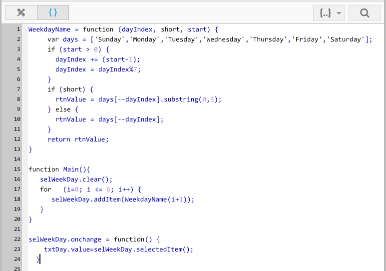
- Add the following code to the selWeekDay onChange event:
  selWeekDay.onchange = function() {
    txtDay.value=selWeekDay.selectedItem();
  }
- The first and last lines define the begining and end of the function that will be called when the weekday is changed in the selWeekDay combo box.
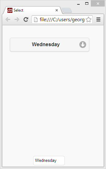
- The second line is executed when this change takes place and takes the selected value and writes it to the txtDay text box. This code change will update the text box every time the user clicks on the combo box.
Testing the Program
Once again, press F5 to start the program.
Additional Properties, Methods, and Events
Like all objects, Select control has a number of properties, methods, and events for using and configuring the Select control. You can see all of these in the Properties Window once you select a combo box on your form. They are also available in the App Studio Handbook or by viewing the online documentation. Listed here are some of the more common ones you will use in your programs.
Select control Properties (see Select control documentation for a full list)
- Disabled - Enables or disables the combo box
- Height - Sets and displays the height of the combo box
- ID - The id used to identify the combo box in your code
- Left - Sets and displays the left edge positioning of the combo box on your form
- Style - Formatting (font attributes) code for your combo box
- Name - Designates the title of your combo box
- Top - Designates the top edge position for your combo box on your form
- Width - Specifies the width, and ultimately the position of the right edge, of the combo box
Select control Events
- onChange - Creates an onChange event function in your code page
- onClick - Creates an onClick event function in your code page
- onFocus - Creates an onFocus event function in your code page
- onGestureEnd - Creates an onGestureEnd event function in your code page
- onMouseDown - Creates an onMouseDown event function in your code page
- onMouseMove - Creates an onMouseMove event function in your code page
- onMouseOut - Creates an onMouseOut event function in your code page
- onMouseUp - Creates an onMouseUp event function in your code page
- onTouchStart - Creates an onTouchStart event function in your code page
