Line: Difference between revisions
Jump to navigation
Jump to search
Created page with "file:Line.jpg == Description == The Line control is used to display horizontal and vertical lines. To add a Line to your app, choose the Line icon in the Toolbar, then ..." |
No edit summary |
||
| Line 1: | Line 1: | ||
[[file:Line. | [[file:Line.png]] | ||
== Description == | == Description == | ||
Revision as of 14:03, 13 June 2013
Description
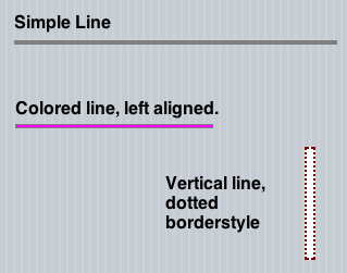
The Line control is used to display horizontal and vertical lines.
To add a Line to your app, choose the Line icon in the Toolbar, then position it on the Design Screen. Use the Property Editor to set the properties you need.
Properties
Standard properties are supported, plus:
| Caption | The caption of the label. Same as textContent. Runtime only. |
| innerHTML | The text of the title in HTML format. Runtime only. |
| textContent | The text of the title. |
| verticalAlign | The vertical alignment of the text: top, center, or bottom. Do not use for multi line labels. |
Events
This control is display only - it does not have any events.
