Some Controls in depth: Difference between revisions
| Line 259: | Line 259: | ||
{| class="wikitable" | {| class="wikitable" | ||
|- | |- | ||
| background || Specify the background you want. Here's a fancy gradient | | background || Specify the background you want. Here's a fancy gradient: | ||
<code>background: -webkit-gradient(linear, left top, left bottom, | <code>background: -webkit-gradient(linear, left top, left bottom, from(#55aaee), to(#003366)); | ||
</code> | </code> | ||
|- | |- | ||
Revision as of 22:48, 9 December 2013
Controls make the visual elements of your app.
An app will have one or more forms. Each form will have a collection of controls on it, customized by you with different sizes and appearances.
In this section, we will see how to add controls and forms to an app.
Add controls to your app by dragging and dropping them into place. Then, resize and set the properties.
Let's look at some controls.
Label
Controls are defined by their properties. The Label control is a simple control. Most of the properties for a control are set to default values when the control is created, so it is usable right away. Let's look at the options for customizing it.

| align | left, center, right |
| alignVertical | top, center, bottom (no % or multiline) |
| backgroundColor | colors can be a name, #RRGGBB, rgb(R,G,B) or transparent |
| borderColor | |
| borderStyle | solid, dotted, dashed, etc. |
| borderWidth | pixels |
| bottom | pixels, percent, auto |
| class | grayTitle default. Can be custom css. |
| color | Of the text |
| fontFamily | helvetica is default |
| fontSize | in pixels. 16 is the default. |
| fontStyle | normal, italic or oblique |
| fontWeight | normal, bold or a number |
| height | |
| hidden | true or false |
| id | The name of the control. |
| left | |
| onclick, etc | names of functions to be called when these events happen. |
| right | |
| style | css style |
| textContent | The content of the label. HTML is OK! |
| top | |
| width |
TextBox
The TextBox has many of the same properties as the label - plus some additional ones:
| autocapitalize | Automatically capitalize first letter? May not be available on all platforms. |
| autocomplete | Automatically complete words? May not be available on all platforms. |
| autocorrect | Spellcheck as entering? May not be available on all platforms. |
| inputType | Specifies what kind of data will be input. Choices are:
|
| placeholder | Text to be displayed in the field just as a comment – does not change the value. |
| readonly | If set to “True”, the control cannot be edited. At runtime, use readOnly. |
| size | Maximum characters allowed. |
| text | The contents of the TextBox. Same as value. |
| value | The contents of the TextBox. This is always returned as a string. Convert it to a number before doing arithmetic on it. |
Button
- iWebKit jQuery Mobile
There are many different appearances for buttons.
- Buttons can have an optional icon.
- Buttons can have optional text.
- Buttons can be grouped
- Different frameworks will have different appearances.
| ChangeForm | The name of the form to go to if this button is clicked. |
| corners | round or square. |
| groupBegin | If you have a group of buttons, set this to Yes on the first one. jQuery Mobile only. |
| groupEnd | If you have a group of buttons, set this to Yes on the last one. jQuery Mobile only. |
| icon | Set to false for no icon. You have a choice of 18 standard icons otherwise. jQuery Mobile only. |
| iconPos | Position of the icon. Can be none, left, right, top, bottom or notext. jQuery Mobile only. |
| image | Path to image to show instead of title on the button. jQuery Mobile only. |
| mini | true/false. For jQuery Mobile, should the text be normal size or mini size? |
| onclick() | The function to be called when this button is clicked. |
| value | The title of the button. |
Here is some sample code for when a button is clicked:
Rem Button Example

Function Button1_onclick()
  Msgbox "Hello World"
End Function
HeaderBar
The Header bar puts a title at the top of the form.
- The left and right buttons are optional. They can be with or without text or icons.
- When a button on it is clicked, the name of that button is passed to the onclick function.
- You can also use the buttons to go to a new form.
| leftChangeForm | The name of the form to go to if the left button is clicked. |
| leftButtonIcon | Names of icon for left button. Use false for no icon, or alert, arrow-d, arrow-l ,arrow-r, arrow-u ,back, check, delete, forward, gear, grid, home, info, minus, plus, refresh, search, star. Design time only. |
| leftButtonName | The name of the left icon. Design time only. |
| rightChangeForm | The name of the form to go to if the right button is clicked. |
| rightButtonIcon | Names of icon for right button. Use false for no icon, or alert, arrow-d, arrow-l ,arrow-r, arrow-u ,back, check, delete, forward, gear, grid, home, info, minus, plus, refresh, search, star. Design time only. |
| rightButtonName | The name of the right icon. Design time only. |
| title | The title which appears in the center of the bar. Design time only. |
Here is some code showing what happens in its onclick function:
Function HeaderBar1_onclick(button)
  If TypeName(button)="object" Then Exit Function
  MsgBox "Button '" & button & "' clicked."
End Function
List
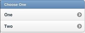
The List control is used to display a menu list.
- Each line can have a name, a number and an image.
- Selecting one will call the onclick function for it, with the line number as a parameter.
- Lines can be added to deleted at runtime.
- List can also be made scrollable if there are more items than fit.
| ChangeForm | A comma separated list of form names to go to if a line is clicked. |
| dividers | Is the item a divider? Comma separated list of Y and N. Design time. |
| dividerTheme | Which theme should all the dividers have? A-z. Design time |
| images | Image file names for each line, comma separated. Design time |
| imageStyle | None, 16x16 or 80x80. Design time |
| items | List of item names, comma separated. Since commas act as separators, use , instead of a comma in the middle of your text. Items can be plain text or HTML. Hard returns are ignored. Design time.
Example: Choose One, Apples, Oranges |
| showNumbers | Show numbers to the left of each item. True/false. Design time |
| getItem(i) | Returns the text of item i. |
| getItemCount() | Returns the number of of items. Runtime. |
| deleteItem("all") | Delete all items. With no argument, just the last item is deleted. Runtime. |
| addItem(text, img, n, header) | Add a new item at postion n with text and img. text can be html. Runtime. If header is true, the line appears as a heading. Only text is required. |
| replaceItem(n, text, img) | Replace item n with new text and optional img. Runtime. |
| refresh() | Redraw list after updating. Runtime. |
| scroll_options | Set display options for scrolling. |
| Scrolling | on or off. |
| showNumbers | true/false |
Function List1_onclick(i)
  If TypeName(i)="object" Then Exit Function
  MsgBox "Menu item chosen: " & i & " " & List1.getItem(i)
End Function
Form
Forms act as containers for controls.
- To add a Form to your app, choose Add Form from the Project menu at the top of the screen.
- Forms can be deleted in the Project Explorer.

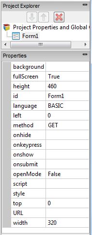
| background | Specify the background you want. Here's a fancy gradient:
|
| fullscreen | True/False. Should the form fill the entire screen? |
| height | The height of the form in pixels. Default is 460. |
| left | The left position of the form. Use this for forms that are not full screen. |
| fullscreen | The form will automatically be the same size as the device screen. The Design Screen will still use height and width. |
| language | The programming language used in the code for the form. Can be BASIC or JavaScript. |
| method | Get or Post. The method that the http form is sent by. |
| openMode | Should the form be open at startup? Use this for forms which are to remain open. There is no need to set this for the first form of the project: that is set in Project Properties. |
| script | Opens the Code Window for the form. |
| style | The CSS style for the form. |
| Url | The URL to be called when the form is submitted using the submit() function. |
| width | The width of the form in pixels. Default is 320. Percents can be set at runtime. |
| reset() | Clear all fields on the form. Runtime only. |
| submit() | Submit the data on the form to the specified URL. Runtime only. See Location as well. |

