PopUp: Difference between revisions
Jump to navigation
Jump to search
No edit summary |
|||
| Line 35: | Line 35: | ||
== Example == | == Example == | ||
To respond to a user selecting an item in | To respond to a user selecting an item in a PopUp Picker, do the following: | ||
<pre> | <pre> | ||
Function PopUp1_onclick(m) | Function PopUp1_onclick(m) | ||
Revision as of 21:43, 14 February 2014
Description
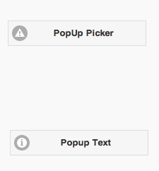
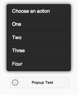
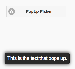
The PopUp control is used to display a popup or text centered over the PopUp button. There are two styles: a PopUp Picker, which brings up a list of choices, and PopUp Text, which simply displays a message.
Properties
Standard properties are supported, plus:
| dataTheme | Theme for PopUp: a-z. a is normal, b is black and others custom. |
| dataTransition | How should the popup be animated? Choices are none, pop, fade, flip, turn, flow, slide, slide fade, slide up, slide down. |
| icon | Icon to show - choose from 50. |
| iconPos | Position of icon. Can be none, left, right, top, bottom, notext. |
| items | Comma separated list of PopupMenu items. Leave blank for simple popup. |
| message | The message which appears when the mouse is over the icon. Could be something like "Learn more". Does not do anything on touchscreen devices. |
| popup | For a PopUp Picker, the heading of the PopUp. For PopUp Text, the text of the PopUp. |
| tipWidth | The width of the tip. Can be in pixels (100px) or a percent of screen width (50%). |
Events
Standard events are supported. However, events are not usually associated with the control.
Example
To respond to a user selecting an item in a PopUp Picker, do the following:
 Function PopUp1_onclick(m)
  If typeof(m)="object" Then Exit Function
  MsgBox m
  PopUp1.close()
End Function


