Switch (Bootstrap): Difference between revisions
Jump to navigation
Jump to search
No edit summary |
|||
| Line 42: | Line 42: | ||
[[Category:Controls]] | [[Category:Controls]] | ||
[[Category:Bootstrap]] | |||
Revision as of 14:04, 2 February 2019
This control was added in Bootstrap 4.
Description
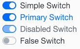
The Switch control is a slider that changes between Off and On.
To add a Switch to your app, choose the Switch icon in the Toolbar, then position it on the Design Screen. Use the Property Editor to set the properties you need, then add functions to your code to respond to the events that come from the Switch: usually, just onchange.
Properties
Standard properties are supported, plus these, which can be set at Design Time:
| text | The text of the control. Default is true. Design Time and Runtime. |
| textColor | The color of the text. Uses Bootstrap standard colors. |
| value | The value of the control. Default is true. Design Time and Runtime. |
Example (BASIC)
Get value when toggle changed:
 Function Switch1_onchange()
   MsgBox "New value is " & Switch1.value
 End Function
Example (JavaScript)
 Switch1.onchange = function() {
     NSB.MsgBox("New value is " + Switch1.value);
 };
