Card (Bootstrap): Difference between revisions
No edit summary |
|||
| Line 16: | Line 16: | ||
{| class="wikitable" | {| class="wikitable" | ||
|- | |- | ||
| footer || Optional. The text at the bottom of the Card. Class, style and text can be specified. | | footer || Optional. The text at the bottom of the Card. Class, style and text can be specified. Design time. | ||
|- | |- | ||
| header || Optional. The text at the top of the Card. Class, style and text can be specified. | | header || Optional. The text at the top of the Card. Class, style and text can be specified. Design time. | ||
|- | |- | ||
| image || Optional. The image displayed under the ''header''. src, class, style, height and width can be specified. | | image || Optional. The image displayed under the ''header''. src, class, style, height and width can be specified. Design time. | ||
|- | |- | ||
| position || How will children be positioned? Absolute, fixed, relative or static. | | position || How will children be positioned? Absolute, fixed, relative or static. Design time. | ||
|- | |- | ||
| subtitle || Optional. The text under the ''title''. Class, style and value can be specified. | | subtitle || Optional. The text under the ''title''. Class, style and value can be specified. Design time. | ||
|- | |- | ||
| text || Optional. The text under the ''subtitle''. Class, style and value can be specified. | | text || Optional. The text under the ''subtitle''. Class, style and value can be specified. Design time. | ||
|- | |- | ||
| title || Optional. The text under the ''image''. Class, style and value can be specified. | | title || Optional. The text under the ''image''. Class, style and value can be specified. Design time. | ||
|- | |- | ||
|} | |} | ||
Revision as of 17:24, 4 December 2019
This control was added in Bootstrap 4.
Description
Bootstrap’s cards provide a flexible and extensible content container with multiple variants and options.
A card is a flexible and extensible content container. It includes options for headers and footers, a wide variety of content, contextual background colors, and powerful display options. If you’re familiar with Bootstrap 3, cards replace our old panels, wells, and thumbnails. Similar functionality to those components is available as modifier classes for cards.
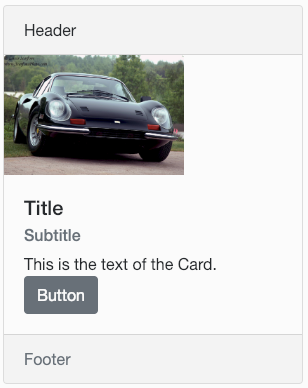
It can also act as a container for child controls. In the example above, the Button is a child which has been added to the Card.
Properties and Methods
Standard properties are supported, plus:
| footer | Optional. The text at the bottom of the Card. Class, style and text can be specified. Design time. |
| header | Optional. The text at the top of the Card. Class, style and text can be specified. Design time. |
| image | Optional. The image displayed under the header. src, class, style, height and width can be specified. Design time. |
| position | How will children be positioned? Absolute, fixed, relative or static. Design time. |
| subtitle | Optional. The text under the title. Class, style and value can be specified. Design time. |
| text | Optional. The text under the subtitle. Class, style and value can be specified. Design time. |
| title | Optional. The text under the image. Class, style and value can be specified. Design time. |
Events
Standard events are supported.
Examples
This is a passive control - no code sample needed. Try Cards in the AppStudio Samples.
