ComboBox: Difference between revisions
| Line 70: | Line 70: | ||
<pre> | <pre> | ||
//ComboBox is used to display a picker with different values | |||
for (i=0; i <= 6; i++) { | for (i=0; i <= 6; i++) { | ||
ComboBox1.addItem(WeekdayName[i+1], WeekdayName[i+1]); | ComboBox1.addItem(WeekdayName[i+1], WeekdayName[i+1]); | ||
Revision as of 06:11, 1 May 2013
Description
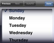
The ComboBox is used to display a picker with different values. The selected value is displayed. When the control is tapped on, a new window opens with a list of options.
While a variety of different events are available, the usual response to clicking a ComboBox is to call the function ID_onchange(), where ID is the id of the control.
To set up the items in the ComboBox, either add them to the items property in the IDE, or use the ID.AddItem function to add them at runtime. Each item can also have a value, which you can define in the IDE or at runtime. If you do not define a value, it defaults to the line number, starting at 1.
To add a ComboBox to your app, choose the ComboBox icon in the Toolbar, then position it on the Design Screen. Use the Property Editor to set the properties you need, then add functions to your code to respond to the events that come from the button: usually, just ID_onchange().
To set the selection in code, use ID.setIndex(n).
This control is part of iWebKit. The equivalent control in jQuery Mobile is Select.
Methods and Properties
Standard properties are supported, plus:
| addItem(item[,value]) | Add item to the list. You can also have an optional value. |
| clear() | Clear the list |
| getItemCount() | The number of items on the list |
| List(n) | Get the text of item n. |
| ListCount | The number of items. Same as getItemCount(). |
| ListIndex | Gets or set the current selection number. If set, calls the control’s _onclick() and _onchange() functions. |
| removeItem(n) | Remove item n. |
| selectedIndex() | The number of the current selection, starting from 0. |
| selectedItem() | The text of the currently selected item. |
| selectedValue() | The value of the currently selected item. |
| setIndex(n) | Set the current selection to n. |
| setText(value) | Set the text of the current selection to value. |
| setValue(value) | Set the value of the current selection to value. |
| text | The text of the current selection. Same as selectedItem(). |
Events
Standard events are supported. For this control, the onchange event will be most useful.
Example (Basic)
Rem ComboBox is used to display a picker with different values

For i=0 To 6
  ComboBox1.addItem(WeekdayName(i+1), WeekdayName(i+1))
Next

Function ComboBox1_onchange()
  MsgBox "selectedItem is " & ComboBox1.selectedItem()
End Function
Example (JavaScript)
//ComboBox is used to display a picker with different values

for   (i=0; i <= 6; i++) {
  ComboBox1.addItem(WeekdayName[i+1], WeekdayName[i+1]);
}

ComboBox1.onchange = function() {
  savethefunction_rvar="";
  _msgbox_confirm("selectedItem is "  +  ComboBox1.selectedItem());
  return savethefunction_rvar;
}
Output
(on an iPhone – other devices may look different)
