Some Controls in depth: Difference between revisions
| Line 20: | Line 20: | ||
Controls are defined by their properties. The Label control is a simple control. Most of the properties for a control are set to default values when the control is created, so it is usable right away. Let's look at the options for customizing it. | Controls are defined by their properties. The Label control is a simple control. Most of the properties for a control are set to default values when the control is created, so it is usable right away. Let's look at the options for customizing it. | ||
[[File:Labelcontrol.JPG|right| | [[File:Labelcontrol.JPG|right|100x]] | ||
<br><br><br><br><br><br> | <br><br><br><br><br><br> | ||
Revision as of 10:41, 13 December 2013
Controls make the visual elements of your app.
- An app will have one or more forms. Each form will have a collection of controls on it, customized by you with different sizes and appearances.
- In this section, we will see how to add controls and forms to an app.
- Add controls to your app by dragging and dropping them into place. Then, resize and set the properties.
- It is good practice to name your controls consistently.
- A common way is to have three letters for the type, followed by a name for the control.
- For example, lblName, txtCustomer, butSave, lstSaves
Let's look at some controls.
Label
Controls are defined by their properties. The Label control is a simple control. Most of the properties for a control are set to default values when the control is created, so it is usable right away. Let's look at the options for customizing it.

| align | left, center, right |
| alignVertical | top, center, bottom (no % or multiline) |
| backgroundColor | colors can be a name, #RRGGBB, rgb(R,G,B)
or transparent |
| borderColor | |
| borderStyle | solid, dotted, dashed, etc. |
| borderWidth | pixels |
| bottom | pixels, percent, auto |
| class | grayTitle default. Can be custom css. |
| color | Of the text |
| fontFamily | helvetica is default |
| fontSize | in pixels. 16 is the default. |
| fontStyle | normal, italic or oblique |
| fontWeight | normal, bold or a number |
| height | |
| hidden | true or false |
| id | The name of the control. |
| left | |
| onclick, etc | names of functions to be called when
these events happen. |
| right | |
| style | css style |
| textContent | The content of the label. HTML is OK! |
| top | |
| width |
TextBox
The TextBox has many of the same properties as the label - plus some additional ones:
| autocapitalize | Automatically capitalize first letter? May not be available on all platforms. |
| autocomplete | Automatically complete words? May not be available on all platforms. |
| autocorrect | Spellcheck as entering? May not be available on all platforms. |
| inputType | Specifies what kind of data will be input. Choices are:
|
| placeholder | Text to be displayed in the field just as a comment – does not change the value. |
| readonly | If set to “True”, the control cannot be edited. At runtime, use readOnly. |
| size | Maximum characters allowed. |
| text | The contents of the TextBox. Same as value. |
| value | The contents of the TextBox. This is always returned as a string. Convert it to a number before doing arithmetic on it. |
Button
- iWebKit jQuery Mobile
There are many different appearances for buttons.
- Buttons can have an optional icon.
- Buttons can have optional text.
- Buttons can be grouped
- Different frameworks will have different appearances.
| ChangeForm | The name of the form to go to if this button is clicked. |
| corners | round or square. |
| groupBegin | If you have a group of buttons, set this to Yes on the first one. jQuery Mobile only. |
| groupEnd | If you have a group of buttons, set this to Yes on the last one. jQuery Mobile only. |
| icon | Set to false for no icon. You have a choice of 18 standard icons otherwise. jQuery Mobile only. |
| iconPos | Position of the icon. Can be none, left, right, top, bottom or notext. jQuery Mobile only. |
| image | Path to image to show instead of title on the button. jQuery Mobile only. |
| mini | true/false. For jQuery Mobile, should the text be normal size or mini size? |
| onclick() | The function to be called when this button is clicked. |
| value | The title of the button. |
Here is some sample code for when a button is clicked:
Rem Button Example

Function Button1_onclick()
  Msgbox "Hello World"
End Function
HeaderBar
The Header bar puts a title at the top of the form.
- The left and right buttons are optional. They can be with or without text or icons.
- When a button on it is clicked, the name of that button is passed to the onclick function.
- You can also use the buttons to go to a new form.
| leftChangeForm | The name of the form to go to if the left button is clicked. |
| leftButtonIcon | Names of icon for left button. Use false for no icon, or alert, arrow-d, arrow-l ,arrow-r, arrow-u ,back, check, delete, forward, gear, grid, home, info, minus, plus, refresh, search, star. Design time only. |
| leftButtonName | The name of the left icon. Design time only. |
| rightChangeForm | The name of the form to go to if the right button is clicked. |
| rightButtonIcon | Names of icon for right button. Use false for no icon, or alert, arrow-d, arrow-l ,arrow-r, arrow-u ,back, check, delete, forward, gear, grid, home, info, minus, plus, refresh, search, star. Design time only. |
| rightButtonName | The name of the right icon. Design time only. |
| title | The title which appears in the center of the bar. Design time only. |
Here is some code showing what happens in its onclick function:
Function HeaderBar1_onclick(button)
  If TypeName(button)="object" Then Exit Function
  MsgBox "Button '" & button & "' clicked."
End Function
List
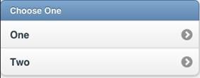
The List control is used to display a menu list.
- Each line can have a name, a number and an image.
- Selecting one will call the onclick function for it, with the line number as a parameter.
- Lines can be added to deleted at runtime.
- List can also be made scrollable if there are more items than fit.
| ChangeForm | A comma separated list of form names to go to if a line is clicked. |
| dividers | Is the item a divider? Comma separated list of Y and N. Design time. |
| dividerTheme | Which theme should all the dividers have? A-z. Design time |
| images | Image file names for each line, comma separated. Design time |
| imageStyle | None, 16x16 or 80x80. Design time |
| items | List of item names, comma separated. Since commas act as separators, use , instead of a comma in the middle of your text. Items can be plain text or HTML. Hard returns are ignored. Design time.
Example: |
| showNumbers | Show numbers to the left of each item. True/false. Design time |
| getItem(i) | Returns the text of item i. |
| getItemCount() | Returns the number of of items. Runtime. |
| deleteItem("all") | Delete all items. With no argument, just the last item is deleted. Runtime. |
| addItem(text, img, n, header) | Add a new item at postion n with text and img. text can be html. Runtime. If header is true, the line appears as a heading. Only text is required. |
| replaceItem(n, text, img) | Replace item n with new text and optional img. Runtime. |
| refresh() | Redraw list after updating. Runtime. |
| scroll_options | Set display options for scrolling. |
| Scrolling | on or off. |
| showNumbers | true/false |
Function List1_onclick(i)
  If TypeName(i)="object" Then Exit Function
  MsgBox "Menu item chosen: " & i & " " & List1.getItem(i)
End Function
Form
Forms act as containers for controls.
- To add a Form to your app, choose Add Form from the Project menu at the top of the screen.
- Forms can be deleted in the Project Explorer.
- Forms can be exported or imported to different projects.

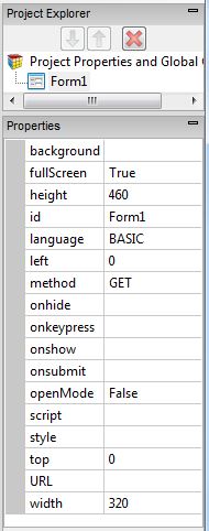
| background | Specify the background you want. It can be the usual colors , or a fancy gradient:
|
| fullscreen | True/False. Should the form fill the entire screen? |
| height | The height of the form in pixels. Default is 460. |
| left | The left position of the form. Use this for forms that are not full screen. |
| fullscreen | The form will automatically be the same size as the device screen. The Design Screen will still use height and width. |
| language | The programming language used in the code for the form. Can be BASIC or JavaScript. |
| method | Get or Post. The method that the http form is sent by. |
| openMode | Should the form be open at startup? Use this for forms which are to remain open. There is no need to set this for the first form of the project: that is set in Project Properties. |
| script | Opens the Code Window for the form. |
| style | The CSS style for the form. |
| Url | The URL to be called when the form is submitted using the submit() function. |
| width | The width of the form in pixels. Default is 320. Percents can be set at runtime. |
| reset() | Clear all fields on the form. Runtime only. |
| submit() | Submit the data on the form to the specified URL. Runtime only. See Location as well. |

