Camera: Difference between revisions
Jump to navigation
Jump to search
| Line 14: | Line 14: | ||
{| class="wikitable" | {| class="wikitable" | ||
|- | |- | ||
| corners || round or square | | corners || round or square. | ||
|- | |- | ||
| icon || Set to false for no icon. You have a choice of 18 standard icons otherwise. | | icon || Set to false for no icon. You have a choice of 18 standard icons otherwise. | ||
| Line 22: | Line 22: | ||
| image || Path to image to show instead of title on the button. | | image || Path to image to show instead of title on the button. | ||
|- | |- | ||
| mini || true/false. | | mini || true/false. Should the text be normal size or mini size? | ||
|- | |- | ||
| picturebox || The ID of the PictureBox control on the form to put the picture into. | | picturebox || The ID of the PictureBox control on the form to put the picture into. | ||
Revision as of 13:22, 16 April 2014
Description
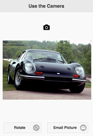
The Camera control lets you take pictures using your device's camera and display them in a PictureBox. The contents of that PictureBox can be saved in a database or sent to a server. All the settings needed to take a picture can be set at design time in AppStudio: no additional code needs to be written.
The default icon is a camera icon. You can change this to a different icon or text.
The Cameral control has the same properties as a Button, with one addition, the picturebox property.
Properties and Methods
Standard properties are supported, plus:
| corners | round or square. |
| icon | Set to false for no icon. You have a choice of 18 standard icons otherwise. |
| iconPos | Position of the icon. Can be none, left, right, top, bottom or notext. |
| image | Path to image to show instead of title on the button. |
| mini | true/false. Should the text be normal size or mini size? |
| picturebox | The ID of the PictureBox control on the form to put the picture into. |
| value | The title of the button. Design time or runtime. |
Events
Events are handled by the control itself.
Example
No code needed - it just works!
