Responsive Design Made Simple: Difference between revisions
| Line 9: | Line 9: | ||
RWD combines the two approaches. Developers can still layout the controls on their apps, but make them responsive to the screen size so they automatically adjust and reflow. In AppStudio 5, we're adding the ability to use this in your apps. | RWD combines the two approaches. Developers can still layout the controls on their apps, but make them responsive to the screen size so they automatically adjust and reflow. In AppStudio 5, we're adding the ability to use this in your apps. | ||
== A | == A Simple Example == | ||
Let's start with an example. We'll set up a Container which holds some buttons: | Let's start with an example. We'll set up a Container which holds some buttons: | ||
| Line 35: | Line 35: | ||
</pre> | </pre> | ||
This | This forces a 6 pixel margin around each control. | ||
== A Detail Example == | |||
[[File:Rwd03.png]] | |||
[[File:Rwd04.png||none|Container on a narrow screen]] | |||
Revision as of 18:12, 31 March 2015
Introduction
Responsive web design (RWD) is a web design approach aimed at crafting sites to provide an optimal viewing experience—easy reading and navigation with a minimum of resizing, panning, and scrolling—across a wide range of devices (from desktop computer monitors to mobile phones). Responsive Web Design is a method of building websites that are highly functional on wide range of desktops & provide “app-like” experiences on smart phones, tablets and e-readers. Responsive design is a preferable alternative to bespoke mobile versions as modern mobile devices are not set to a standard resolution. Producing a specific site for several resolutions would be incredibly time consuming and near impossible to get right.
Traditionally, developers have laid out app with controls in fixed places. Tools like Visual Studio made this easy: drag and drop your control where you want them on the design screen and they are fixed in place.
Websites have the ability to resize and flow their elements to adjust to different screen sizes dynamically.
RWD combines the two approaches. Developers can still layout the controls on their apps, but make them responsive to the screen size so they automatically adjust and reflow. In AppStudio 5, we're adding the ability to use this in your apps.
A Simple Example
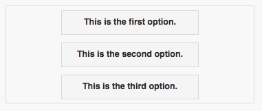
Let's start with an example. We'll set up a Container which holds some buttons:
Container on a narrow screen:

The same container on a wide screen:

It's the same container. No code is involved: the controls move themselves into position based on the screen width.
How does this work?
One of the style attributes of any control is position. Before AppStudio 5, the only option for this was 'absolute'. It can now also be 'relative'. By default, all controls in a container have position set to 'relative'. Forms also have this option: if position is set to relative, the controls on the form will all have their position set to relative.
The rest of the positioning for the controls is set in the style property of the controls. To center all the controls in the container, we add this to the Container's style control:
text-align:center; margin:auto;
For each button, style is set to
margin: 6px;
This forces a 6 pixel margin around each control.
A Detail Example

