Button (Bootstrap): Difference between revisions
Jump to navigation
Jump to search
Created page with "file:Bsbutton.png == Description == Buttons can be clicked on by users to initial actions. By setting the appearance, buttons can have different colors. == Properties..." |
No edit summary |
||
| Line 1: | Line 1: | ||
[[file: | [[file:Bsbuttons.png]] | ||
== Description == | == Description == | ||
Revision as of 21:59, 31 May 2016
Description
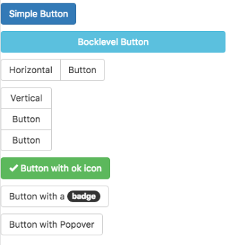
Buttons can be clicked on by users to initial actions.
By setting the appearance, buttons can have different colors.
Properties and Methods
Standard properties are supported, plus:
| appearance | Appearance of the alert. Can be success, info, warning, danger. |
| badge | Adds a Badge to the alert. |
| blocklevel | Make the button full width of parent? |
| ChangeForm | id of the form to change to if clicked. Optional. |
| grouping | Is this button part of a group? Choices are No, Start Horizontal, Start Vertical, Middle and End. |
| groupStyle | The styling to apply to the entire group. |
| icon | Icon to put at right of control from the Glyph set. Examples: remove, ok. Optional. http://getbootstrap.com/components/#glyphicons |
| size | The size of the button. Can be large, medium, small or extra small. |
| value | The title of the button. Design time or runtime. |
Events
Standard events are supported. For this control, the onclick event will be most useful.
Example (Basic)
Function Button1_onclick()
  MsgBox "You can display a message or take other action when clicked"
End Function
Example (JavaScript)
Button1.onclick = function() {
    NSB.MsgBox("You can display a message or take other action when clicked");
};
