GridRow (Bootstrap): Difference between revisions
Jump to navigation
Jump to search
Created page with "This screenshot has 3 Gridcolumn controls, each with its own group of children. The first Gridcolumn has a header, the second a Radiobutton and the third has a Cuatomer. Te ar..." |
|||
| Line 12: | Line 12: | ||
Standard [[properties and methods|properties]] are supported. | Standard [[properties and methods|properties]] are supported. | ||
== Events == | == Events == | ||
Revision as of 12:15, 5 June 2016
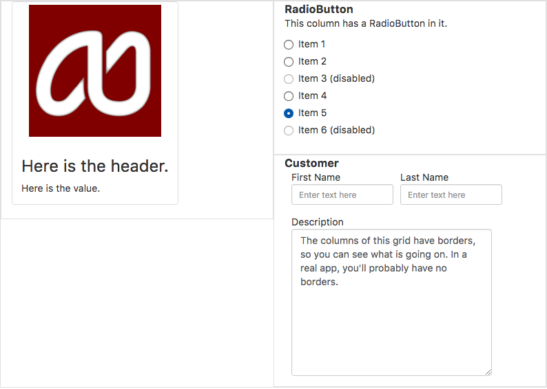
This screenshot has 3 Gridcolumn controls, each with its own group of children. The first Gridcolumn has a header, the second a Radiobutton and the third has a Cuatomer. Te arrangement will depend on the screen size.
Description
GridRow is a container for GridColumn controls. It is an important part of making apps responsive, so they appear differently on different screen sizes.
For more information on Bootstrap Grids, see Using Bootstrap Grids.
Properties and Methods
Standard properties are supported.
Events
None.
Example
Not applicable. See Grid for a complete sample with GridRows.
