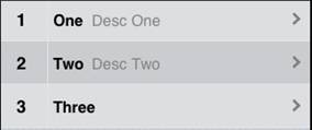
MenuNumberTitleDescArrow: Difference between revisions
No edit summary |
No edit summary |
||
| Line 1: | Line 1: | ||
[[file:MenuNumber.jpg]] | [[file:MenuNumber.jpg]] | ||
== Description == | |||
The Menu control is used to give the user a choice what action to take next. Each item can have a number, title, description and an arrow. | The Menu control is used to give the user a choice what action to take next. Each item can have a number, title, description and an arrow. | ||
| Line 9: | Line 9: | ||
To add a Menu to your app, choose the Menu icon in the Toolbar. Use the Property Editor to set the properties. | To add a Menu to your app, choose the Menu icon in the Toolbar. Use the Property Editor to set the properties. | ||
== Properties and Methods == | |||
Standard [[properties and methods|properties]] are supported, plus: | Standard [[properties and methods|properties]] are supported, plus: | ||
| Line 47: | Line 47: | ||
|} | |} | ||
== Events == | |||
In addition to the standard [[events]], Menu has a modified version of onclick. | In addition to the standard [[events]], Menu has a modified version of onclick. | ||
| Line 55: | Line 55: | ||
|} | |} | ||
== Example == | |||
<pre> | <pre> | ||
| Line 64: | Line 64: | ||
</pre> | </pre> | ||
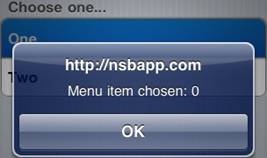
== Output == | |||
[[file:MenuClassicOutput.jpg]] | [[file:MenuClassicOutput.jpg]] | ||
[[Category:Language Reference]] | |||
Revision as of 16:43, 17 August 2012
Description
The Menu control is used to give the user a choice what action to take next. Each item can have a number, title, description and an arrow.
You supply it with a list of items, and it will create one choice for each item. After the control is first displayed. you need to recalulate the size of the scrolling area by doing Controlname.refresh().
To add a Menu to your app, choose the Menu icon in the Toolbar. Use the Property Editor to set the properties.
Properties and Methods
Standard properties are supported, plus:
| addItem(number, title,desc, [item]) | Add new choice at position item on the list. If item is not supplied, add to the end. |
| deleteItem(item) | If item is not supplied, the last one is deleted. If “all”, all items are deleted. |
| Descriptions | A comma separated list of descriptions. (design time) |
| getItem(i) | Returns the text of item i. |
| getItemCount() | Returns the number of items |
| Numbers | Values to be put in the left column. These can be numbers or strings. (design time) |
| refresh() | Recalculates the size of the scrolling area. Do this after the control is displayed. |
| replaceItem(item, number, title, desc) | Replace an existing item |
| scroll_options | This control makes use of iScroll. It has a number of options, including:
bounce: true/false. When the end of the scroll area is reached, should the image bounce? zoom: true/false. Allow two finger zoom in gesture? The full list of options is documented here: http://cubiq.org/iscroll-4 |
| scrollHeight | The size of the scrolling area. (design time) |
| scrolling | Allow choices in the menu to scoll? On or off. (design time) |
| title | Optional. If supplied, will put a heading on top of the list. (design time) |
| Titles | A comma separated list of choices to be offered. (design time) |
Events
In addition to the standard events, Menu has a modified version of onclick.
| onclick(choice) | The number of the choice that was made, starting from 0. |
Example
Function iMenu1_onclick(choice)
  If TypeName(choice)= "object" Then Exit Function
  MsgBox "Menu item chosen: " & choice
End Function

