Label (Bootstrap): Difference between revisions
Jump to navigation
Jump to search
Created page with "file:Bslabel.png == Description == A simple control to display a label. == Properties and Methods == Standard properties are supported, plus..." |
|||
| Line 12: | Line 12: | ||
| appearance || Appearance of the control. Can be success, info, warning, danger. | | appearance || Appearance of the control. Can be success, info, warning, danger. | ||
|- | |- | ||
| value || The title of the control. Design time or runtime | | borderRadius || How should corners be rounded? 4 is a 4 pixel radius. Bootstrap 4. | ||
|- | |||
| labelStyle || Should it be text or a badge? Bootstrap 4. | |||
|- | |||
| value || The title of the control. Design time or runtime. | |||
|} | |} | ||
Revision as of 19:06, 1 February 2019
Description
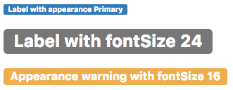
A simple control to display a label.
Properties and Methods
Standard properties are supported, plus:
| appearance | Appearance of the control. Can be success, info, warning, danger. |
| borderRadius | How should corners be rounded? 4 is a 4 pixel radius. Bootstrap 4. |
| labelStyle | Should it be text or a badge? Bootstrap 4. |
| value | The title of the control. Design time or runtime. |
Events
Standard events are supported.
Example
None. Headers are simply passive text.
