Fliptoggle (Bootstrap): Difference between revisions
Jump to navigation
Jump to search
No edit summary |
|||
| Line 53: | Line 53: | ||
[[Category:Controls]] | [[Category:Controls]] | ||
Revision as of 14:08, 2 February 2019
This control is Bootstrap 3 only. Use Switch in Bootstrap 4.
Description
The FlipToggle control is a slider that changes between Off and On.
To add a FlipToggle to your app, choose the FlipToggle icon in the Toolbar, then position it on the Design Screen. Use the Property Editor to set the properties you need, then add functions to your code to respond to the events that come from the FlipToggle: usually, just onchange.
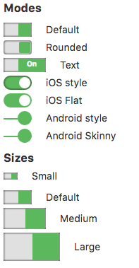
At this time, Android and Android Skinny look the same. An issue has been filed with the author of the control.
This control uses the Titatoggle library. Complete documentation is here: https://kleinejan.github.io/titatoggle.
Properties
Standard properties are supported, plus these, which can be set at Design Time:
| appearance | Color of the text. Can be default, success, info, warning or danger. Design Time. |
| appearanceSlider | Color of the slider. Can be default, info, warning or danger. Not all colors work with all modes. Design Time. |
| size | How big should it be? Can be default, small, medium or large. Design Time. |
| mode | How should the control appear? Options are default, rounded, text, iOS, iOS flat, Android, Android skinny. iOS and Android modes will work on all platforms - it's only the appearance of them. Design Time. |
| text | The text of the control. Default is true. Design Time and Runtime. |
| value | The value of the control. Default is true. Design Time and Runtime. |
Example (BASIC)
Get value when toggle changed:
 Function Fliptoggle1_onchange()
   MsgBox "New value is " & Fliptoggle1.value
 End Function
Example (JavaScript)
 Fliptoggle1.onchange = function() {
     NSB.MsgBox("New value is " + Fliptoggle1.value);
 };
