PopUp
Description
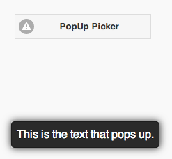
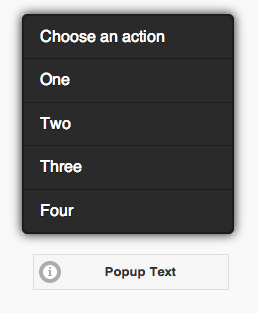
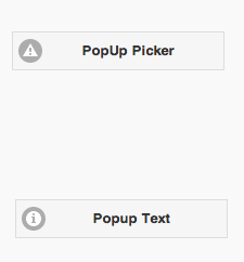
The PopUp control is used to display a text or bring up a picker.
Properties
Standard properties are supported, plus:
| close-icon-position | Where should the close icon appear? To the left, right or not at all? |
| message | The message which appears when the mouse is over the icon. Could be something like "Learn more". Does not do anything on touchscreen devices. |
| popupmsg | The message which appears when the icon is clicked. Can be formatted HTML. |
| tipWidth | The width of the tip. Can be in pixels (100px) or a percent of screen width (50%). |
Events
Standard events are supported. However, events are not usually associated with the control.
Example
To respond to a user selecting an item in the picker, do the following:
 Function PopUp1_onclick(m)
  If typeof(m)="object" Then Exit Function
  MsgBox m
  PopUp1.close()
End Function


