Panel
Description
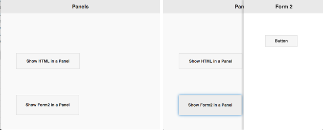
The Panel control is displays HTML or a Form in a panel that floats on top of the current form. It can be animated to appear from the left or right.
To add a Panle to your app, choose the Panel icon in the Toolbar, then position it on the Design Screen. Use the Property Editor to set the properties you need.
Properties
Standard properties are supported, plus:
} open([form]) || Opens form in the panel. If form is blank, uses contents of text property.| animate | Sets whether the panel will animate when opening and closing. If set to false, the panel will just appear and disappear without animation. This is recommended for fastest performance. Design time. |
| dismissable | Sets whether the panel can be closed by clicking outside onto the page. Design time. |
| display | The relationship of the panel to the page contents. Defaults is 'reveal: the panel will sit under the page and reveal as the page slides away. 'overlay" for the panel to appear on top of the page contents. "push" animates both the panel and page at the same time. Design time. |
| positionFixed | Sets whether the panel has fixed positioning so the contents are in view even if the page is scrolled down. This also allows the page to scroll while the panel stays fixed. Design time. |
| text | The text to display on the form. Can be HTML. Leave blank if using Form1.open(Form2). Design time. |
Events
This control is display only - it does not have any events.
