Card (Bootstrap)
Description
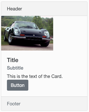
Use the Card control to display a combination of text and images. Since all the fields are optional, there are a lot of different ways to display data using this control.
It can also act as a container for child controls. In the example above, the Button is a child which has been added to the Card.
Properties and Methods
Standard properties are supported, plus:
| footer | Optional. The text at the bottom of the Card. Class, style and text can be specified. |
| header | Optional. The text at the top of the Card. Class, style and text can be specified. |
| image | Optional. The image displayed under the header. src, class, style, height and width can be specified. |
| position | How will children be positioned? Absolute, fixed, relative or static. |
| subtitle | Optional. The text under the title. Class, style and value can be specified. |
| text | Optional. The text under the subtitle. Class, style and value can be specified. |
| title | Optional. The text under the image. Class, style and value can be specified. |
Events
Standard events are supported.
Examples
This is a passive control - no code sample needed. Try Cards in the AppStudio Samples.
