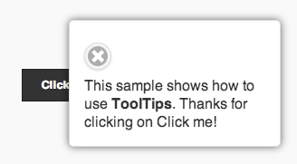
ToolTip
Description
The ToolTip control is used to display a quick message to the user. If the icon is tapped on, the message displays. The user can then dismiss it. The width of the control is defined in the properties. The height is set automatically, depending on the text to be displayed.
When using AppStudio 4 with jQuery Mobile 1.4 on old Android devices (Android OS 2.x), the built in icons will not appear. To fix this, add the following to the manifest property of your project. If your button uses theme 'b', change 'white' to 'black'.
nsb/images/icons-png/user-white.png
Properties
Standard properties are supported, plus:
| data-transition | What animation effect should the popup show with? Choice of 10. |
| message | The message which appears when the mouse is over the icon. Could be something like "Learn more". Does not do anything on touchscreen devices. |
| popupmsg | The message which appears when the icon is clicked. Can be formatted HTML. |
| tipWidth | The width of the tip. Can be in pixels (100px) or a percent of screen width (50%). |
Events
Standard events are supported. However, events are not usually associated with the control.
Example
To change the text of the tooltip at runtime, do the following:
ToolTip1_popupInfo.textContent = "My new text"
To change the text of the hover message at runtime, do the following:
ToolTip1.title = "My new message"

