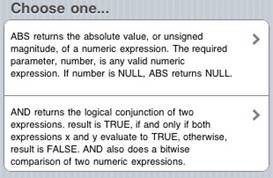
MenuTextBlock
Description
The Menu control is used to give the user a choice what action to take next. Each item can have a description.
You supply it with a list of items, and it will create one choice for each item. When the menu is first displayed, you need to call Controlname.refresh().
To add a Menu to your app, choose the MenuTextBlock icon in the Toolbar. Use the Property Editor to set the properties.
Properties and Methods
Standard properties are supported, plus:
| addItem(textBlock, item) | Add textBlock to position item on the list. If item is not supplied, add to the end. |
| deleteItem(item) | If item is not supplied, the last one is deleted. If “all”, all items are deleted. |
| getItem(i) | Returns the text of item i. |
| getItemCount() | Returns the number of items |
| textBlocks | ” characters. Do not include quote signs or returns in the text. (design time) |
| refresh() | Recalculates the size of the scrolling area when first displayed. |
| replaceItem(item, textBlock) | Replace an existing item |
| scroll_options | This control makes use of iScroll. It has a number of options, including:
bounce: true/false. When the end of the scroll area is reached, should the image bounce? zoom: true/false. Allow two finger zoom in gesture? The full list of options is documented here: http://cubiq.org/iscroll-4 |
| scrollHeight | The size of the scrolling area. (design time) |
| scrolling | Allow choices in the menu to scoll? On or off. (design time) |
| title | Optional. If supplied, will put a heading on top of the list. (design time) |
Events
In addition to the standard events, Menu has a modified version of onclick.
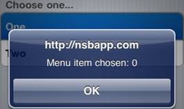
| onclick(choice) | The number of the choice that was made, starting from 0. |
Example
Function iMenu1_onclick(choice)
  If TypeName(choice)= "object" Then Exit Function
  MsgBox "Menu item chosen: " & choice
End Function
Output
Related items

