PopUp
Description
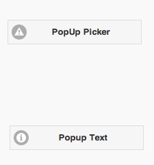
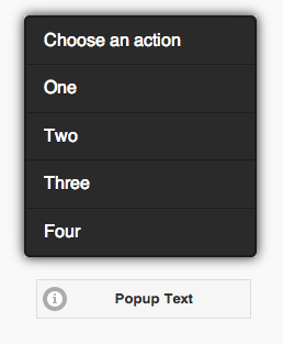
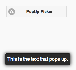
The PopUp control is used to display a popup or text centered over the PopUp button. There are two styles: a PopUp Picker, which brings up a list of choices, and PopUp Text, which simply displays a message.
When using AppStudio 4 with jQuery Mobile 1.4 on old Android devices (Android OS 2.x), the built in icons will not appear. To fix this, add the following to the manifest property of your project. If your button uses theme 'b', change 'white' to 'black'.
nsb/images/icons-png/user-white.png
Properties
Standard properties are supported, plus:
| dataTheme | Theme for PopUp: a-z. a is normal, b is black and others custom. |
| dataTransition | How should the popup be animated? Choices are none, pop, fade, flip, turn, flow, slide, slide fade, slide up, slide down. |
| icon | Icon to show - choose from 50. |
| iconPos | Position of icon. Can be none, left, right, top, bottom, notext. |
| items | Comma separated list of PopupMenu items. Leave blank for simple popup. |
| message | The message which appears when the mouse is over the icon. Could be something like "Learn more". Does not do anything on touchscreen devices. |
| popup | For a PopUp Picker, the heading of the PopUp. For PopUp Text, the text of the PopUp. |
| tipWidth | The width of the tip. Can be in pixels (100px) or a percent of screen width (50%). |
Events
Standard events are supported. However, events are not usually associated with the control.
Example
To respond to a user selecting an item in a PopUp Picker, do the following:
 Function PopUp1_onclick(m)
  If typeof(m)="object" Then Exit Function
  MsgBox m
  PopUp1.close()
End Function


