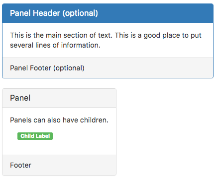
Panel (Bootstrap)
Description
While not always necessary, sometimes you need to put your DOM in a box. For those situations, try the panel component.
It can also act as a container for child controls.
Properties and Methods
Standard properties are supported, plus:
| appearance | Appearance of the control. Can be default, primary, success, info, warning, danger. |
| badge | Adds a Badge to the control. Design Time and Runtime. |
| footer | The text on the bottom. Leave blank for none. Design Time and Runtime. |
| header | The heading in the control. Leave blank for none. Design Time and Runtime. |
| position | How will the children be positioned? absolute, fixed, relative or static. |
| value | The text in the center of the control. Leave blank for none. Design Time and Runtime. |
Events
Standard events are supported.
Example
None - this is a passive control which simply displays.
