Select
Description
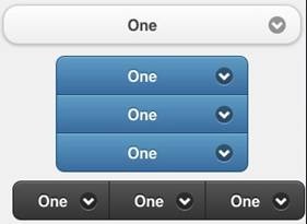
The Select control displays a popup list of choices. When one is picked, the list is closed. Select controls can be grouped. Select control groups may be horizontal or vertical.
To add a Select control to your app, choose the Select icon in the Toolbar, then position it on the Design Screen. Use the Property Editor to set the properties you need.
- REDIRECT Target page name
Properties
Standard properties are supported, plus:
| addItem(item,value) | Add a new item to the list. value is optional. Runtime only. Tip: if you are add many items at once, hide the control before adding and show it again after all adds complete. It will run much faster. |
| clear() | Clear all items from the list. Runtime only. |
| getItemCount() | Return the number of items. Runtime only. |
| groupBegin | If you have a group of buttons, set this to Yes on the first one. Design time only. |
| groupEnd | If you have a group of buttons, set this to Yes on the last one. Design time only. |
| icon | Set to false for no icon. You have a choice of 18 standard icons. Design time only. |
| iconPos | Position of the icon. Can be none, left, right, top, bottom or notext. Design time only. |
| inline | If true, then width is full width of the screen. Design time only. |
| items | The list of items to pop up when control is selected, separated by commas. To insert a comma in a string, use , Design time only. |
| List(n) | Get the text of item n. |
| ListCount | The number of items. Same as getItemCount(). |
| ListIndex | Gets or sets the current selection number. If set, calls the control’s _onclick() and _onchange() functions. |
| multipleSelection | Allow more than one item to be selected? nativeMenu must be false. Design Time only. |
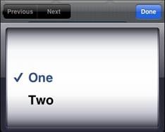
| nativeMenu | Use the native picker instead of the jQuery Mobile picker. Native picker is often nicer on mobile devices. Design time only. |
| overlayTheme | Color theme for the popup list of choices. Design time only. |
| placeholder | Identifies which option is the default. Integer. Design time only. |
| selectedIndex() | The number of the last selected item. If multiple selections, an array is returned. Runtime only. |
| selectedItem() | The item name of the last selected item. If multiple selections, an array is returned. Runtime only. |
| selectedValue() | The value of the last selected item. If multiple selections, an array is returned. Runtime only. |
| setIndex(n) | Sets the current selection.The top item is 0. Runtime only. |
| text | The text of the current selection. Same as selectedItem(). |
| values | An optional list of values associated with each item. Design time only. |
Events
Standard events are supported.
Example (Basic)
Function Select1_onchange()
  MsgBox "Selected: " & Select1.selectedItem()
End Function
To change the font size:
  $("#Select1").find(".ui-btn-inner").css("fontSize", "30px")
  $("#Select1_inner").css("fontSize", "30px")
Example (JavaScript)
Select1.onchange = function() {
 alert("Selected: " + Select1.selectedItem());
}
To change the font size:
  $("#Select1").find(".ui-btn-inner").css("fontSize", "30px")
  $("#Select1_inner").css("fontSize", "30px")
Output
(message box showing “Selected: 2”)
Select popup with nativeMenu set to false:
Select popup with nativeMenu set to true on iOS:


