Select
Description
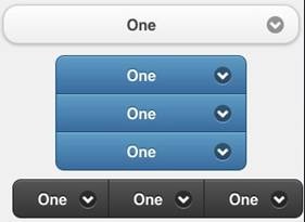
The Select control displays a popup list of choices. When one is picked, the list is closed. Select controls can be grouped. Select control groups may be horizontal or vertical.
To add a Select control to your app, choose the Select icon in the Toolbar, then position it on the Design Screen. Use the Property Editor to set the properties you need.
Properties
Standard properties are supported, plus:
| addItem(item,value) | Add a new item to the list. value is optional. Runtime only. Tip: if you are add many items at once, hide the control before adding and show it again after all adds complete. It will run much faster. |
| clear() | Clear all items from the list. Runtime only. |
| getItemCount() | Return the number of items. Runtime only. |
| groupBegin | If you have a group of buttons, set this to Yes on the first one. Design time only. |
| groupEnd | If you have a group of buttons, set this to Yes on the last one. Design time only. |
| icon | Set to false for no icon. You have a choice of 18 standard icons. Design time only. |
| iconPos | Position of the icon. Can be none, left, right, top, bottom or notext. Design time only. |
| inline | If true, then width is full width of the screen. Design time only. |
| items | The list of items to pop up when control is selected, separated by commas. To insert a comma in a string, use , Design time only. |
| List(n) | Get the text of item n. |
| ListCount | The number of items. Same as getItemCount(). |
| ListIndex | Gets or sets the current selection number. If set, calls the control’s _onclick() and _onchange() functions. |
| multipleSelection | Allow more than one item to be selected? nativeMenu must be false. Design Time only. |
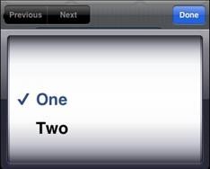
| nativeMenu | Use the native picker instead of the jQuery Mobile picker. Native picker is often nicer on mobile devices. Design time only. |
| overlayTheme | Color theme for the popup list of choices. Design time only. |
| placeholder | Identifies which option is the default. Integer. Design time only. |
| selectedIndex() | The number of the last selected item. If multiple selections, an array is returned. Runtime only. |
| selectedItem() | The item name of the last selected item. If multiple selections, an array is returned. Runtime only. |
| selectedValue() | The value of the last selected item. If multiple selections, an array is returned. Runtime only. |
| setIndex(n) | Sets the current selection.The top item is 0. Runtime only. |
| text | The text of the current selection. Same as selectedItem(). |
| values | An optional list of values associated with each item. Design time only. |
Events
Standard events are supported.
Example (Basic)
Function Select1_onchange()
  MsgBox "Selected: " & Select1.selectedItem()
End Function
To change the font size:
  $("#Select1").find(".ui-btn-inner").css("fontSize", "30px")
  $("#Select1_inner").css("fontSize", "30px")
Example (JavaScript)
Select1.onchange = function() {
 alert("Selected: " + Select1.selectedItem());
}
To change the font size:
  $("#Select1").find(".ui-btn-inner").css("fontSize", "30px")
  $("#Select1_inner").css("fontSize", "30px")
Output
(message box showing “Selected: 2”)
Select popup with nativeMenu set to false:
Select popup with nativeMenu set to true on iOS:


