Button (Bootstrap)
Description
Buttons can be clicked on by users to initiate actions.
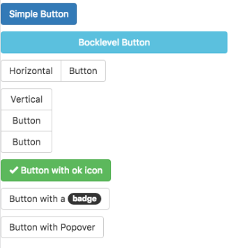
By setting the appearance, buttons can have different colors.
Buttons can be grouped into horizontal and vertical groups.
Properties and Methods
Standard properties are supported, plus:
| appearance | Appearance of the alert. Can be success, info, warning, danger. |
| badge | Adds a Badge to the alert. |
| blocklevel | Make the button full width of parent? |
| ChangeForm | id of the form to change to if clicked. Optional. |
| grouping | Is this button part of a group? Choices are No, Start Horizontal, Start Vertical, Middle and End. |
| groupStyle | The styling to apply to the entire group. |
| icon | Icon to put at right of control from the Glyph set. Examples: remove, ok. Optional. http://getbootstrap.com/components/#glyphicons |
| size | The size of the button. Can be large, medium, small or extra small. |
| value | The title of the button. Design time or runtime. |
Events
Standard events are supported. For this control, the onclick event will be most useful.
Example (Basic)
Function Button1_onclick()
  MsgBox "You can display a message or take other action when clicked"
End Function
Example (JavaScript)
Button1.onclick = function() {
    NSB.MsgBox("You can display a message or take other action when clicked");
};
