// JavaScript
Checkbox1.onchange = function() {
    var choices = "Choices: ";
    for (i = 0; i <= Checkbox1.length - 1; i++) {
        if (Checkbox1.getValue(i)) {
            choices = choices + i + " ";
        }
    }
    NSB.MsgBox(choices);
};
Checkbox (Bootstrap): Difference between revisions
Jump to navigation
Jump to search
(Created page with "file:Bscheckbox.png == Description == Provide contextual feedback messages for typical user actions with the handful of available and flexible alert messages. By settin...") |
|||
| (10 intermediate revisions by the same user not shown) | |||
| Line 3: | Line 3: | ||
== Description == | == Description == | ||
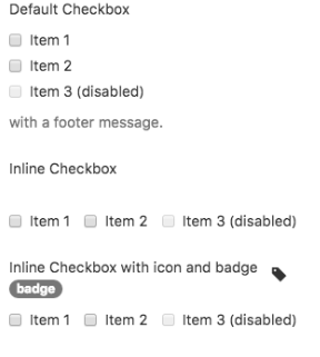
The Checkbox allows users to select a binary option from a list of one or more items. | |||
[[Introduction_to_Bootstrap#Popovers_and_Tooltips|Popovers and Tooltips]] are supported. | |||
== Properties and Methods == | == Properties and Methods == | ||
| Line 12: | Line 12: | ||
{| class="wikitable" | {| class="wikitable" | ||
|- | |- | ||
| | | addItem(''item'', ''type'') || Adds an ''item'' to the end. ''type'' can be "checked" or "disabled" . Runtime. | ||
|- | |- | ||
| badge || Adds a Badge to the | | badge || Adds a Badge to the control. Design Time and Runtime. | ||
|- | |- | ||
| | | clear() || Clears all items. Runtime. | ||
|- | |- | ||
| value || | | footer || An optional message at the bottom of the list of items. Design Time and Runtime. | ||
|- | |||
| getValue(i) || Get the value (true or false) of line i. Starts from 0. Runtime. | |||
|- | |||
| header || An optional message at the top of the list of items. Design Time and Runtime. | |||
|- | |||
| icon || An optional [http://getbootstrap.com/components/#glyphicons icon] to appear at the top of the list. Design Time and Runtime. | |||
|- | |||
| inline || Display items horizontally? Design Time. | |||
|- | |||
| items || Items to show, one per line. Prefix * for disabled, > for selected, ! for heading (not all controls support headings). Design Time. | |||
|- | |||
| length || Items to show, one per line. Prefix * for disabled, > for selected, ! for heading (not all controls support headings). Design Time. | |||
|- | |||
| setValue(i, value) || Set the value (true or false) of line i. Starts from 0. Runtime. | |||
|- | |||
| value || Sets or gets the value. Bootstrap 4: Gets or sets true/false for single row checkbox. | |||
|} | |} | ||
| Line 25: | Line 41: | ||
Standard [[events|events]] are supported. For this control, the onclick event will be most useful. | Standard [[events|events]] are supported. For this control, the onclick event will be most useful. | ||
== Example | == Example == | ||
== | <tabber> | ||
< | JavaScript= | ||
<syntaxhighlight lang="JavaScript"> | |||
NSB.MsgBox( | // JavaScript | ||
Checkbox1.onchange = function() { | |||
var choices = "Choices: "; | |||
for (i = 0; i <= Checkbox1.length - 1; i++) { | |||
if (Checkbox1.getValue(i)) { | |||
choices = choices + i + " "; | |||
} | |||
} | |||
NSB.MsgBox(choices); | |||
}; | }; | ||
</ | </syntaxhighlight> | ||
|-| | |||
BASIC= | |||
<syntaxhighlight lang="vb.net"> | |||
' Basic | |||
Function Checkbox1_onchange() | |||
Dim choices = "Choices: " | |||
For i = 0 To Checkbox1.length-1 | |||
If Checkbox1.getValue(i) Then choices = choices & i & " " | |||
Next | |||
MsgBox choices | |||
End Function | |||
</syntaxhighlight> | |||
</tabber> | |||
== Output == | == Output == | ||
| Line 47: | Line 79: | ||
[[Category:Bootstrap]] | [[Category:Bootstrap]] | ||
Latest revision as of 22:30, 4 February 2020
Description
The Checkbox allows users to select a binary option from a list of one or more items.
Popovers and Tooltips are supported.
Properties and Methods
Standard properties are supported, plus:
| addItem(item, type) | Adds an item to the end. type can be "checked" or "disabled" . Runtime. |
| badge | Adds a Badge to the control. Design Time and Runtime. |
| clear() | Clears all items. Runtime. |
| footer | An optional message at the bottom of the list of items. Design Time and Runtime. |
| getValue(i) | Get the value (true or false) of line i. Starts from 0. Runtime. |
| header | An optional message at the top of the list of items. Design Time and Runtime. |
| icon | An optional icon to appear at the top of the list. Design Time and Runtime. |
| inline | Display items horizontally? Design Time. |
| items | Items to show, one per line. Prefix * for disabled, > for selected, ! for heading (not all controls support headings). Design Time. |
| length | Items to show, one per line. Prefix * for disabled, > for selected, ! for heading (not all controls support headings). Design Time. |
| setValue(i, value) | Set the value (true or false) of line i. Starts from 0. Runtime. |
| value | Sets or gets the value. Bootstrap 4: Gets or sets true/false for single row checkbox. |
Events
Standard events are supported. For this control, the onclick event will be most useful.
Example
' Basic
Function Checkbox1_onchange()
  Dim choices = "Choices: "
  For i = 0 To Checkbox1.length-1
    If Checkbox1.getValue(i) Then choices = choices & i & " "
  Next
  MsgBox choices
End Function
