Collapsible: Difference between revisions
No edit summary |
|||
| Line 14: | Line 14: | ||
Standard [[properties and methods|properties]] are supported, plus: | Standard [[properties and methods|properties]] are supported, plus: | ||
{| class="wikitable" | |||
{| class="wikitable" | {| class="wikitable" | ||
|- | |- | ||
| | | backgroundColor || Color of background. Can be name, #RRGGBB, rgb(R,G,B) or transparent. | ||
|- | |- | ||
| | | color || Color of letters. Can be name, #RRGGBB or rgb(R,G,B) | ||
|- | |- | ||
| | | content ||Content of the control | ||
|- | |- | ||
| | | contentTheme || Theme: a-z. a is normal, b is black and others custom. False for no theme. | ||
|- | |- | ||
| | | expanded || Show control initially expanded | ||
|- | |- | ||
| | | heading || Heading which shows all the time | ||
|- | |- | ||
| | | headingTheme || Theme: a-z. a is normal, b is black and others custom. False for no theme. | ||
|- | |- | ||
| | | iconPos || Icon Position | ||
|- | |||
| mini || Show smaller version of control. | |||
|} | |} | ||
Revision as of 14:00, 12 April 2015
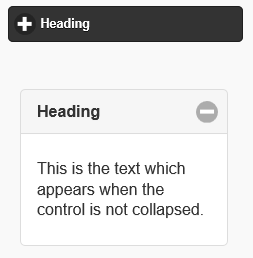
On the top, a closed Collapsible with a black them. Underneath, an open Collapsible with a white theme.
Description
The Collapsible control displays HTML or a Form in a panel that floats on top of the current form. It can be animated to appear from the left or right.
To add a Collapsible to your app, choose the Collapsible icon in the Toolbar, then position it on the Design Screen. Use the Property Editor to set the properties you need.
If a form is opened in a Panel, NSBCurrentForm is set to the new form and the form's onshow() function is called. When the Panel is closed, the onhide() function is called and NSBCurrentForm is set to the previous form. The size of the form is adjusted to be equal the size of the panel.
Properties
Standard properties are supported, plus:
| backgroundColor | Color of background. Can be name, #RRGGBB, rgb(R,G,B) or transparent. |
| color | Color of letters. Can be name, #RRGGBB or rgb(R,G,B) |
| content | Content of the control |
| contentTheme | Theme: a-z. a is normal, b is black and others custom. False for no theme. |
| expanded | Show control initially expanded |
| heading | Heading which shows all the time |
| headingTheme | Theme: a-z. a is normal, b is black and others custom. False for no theme. |
| iconPos | Icon Position |
| mini | Show smaller version of control. |
Events
Example
Open Form2 in a Panel
Panel2.open(Form2)
See above for output.
