Header: Difference between revisions
Jump to navigation
Jump to search
No edit summary |
No edit summary |
||
| Line 3: | Line 3: | ||
== Description == | == Description == | ||
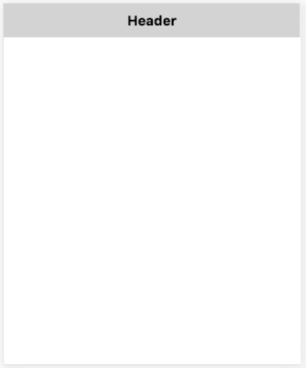
The Header control puts a simple header at the top of the screen. | The Header control puts a simple header at the top of the screen. It also acts as a container, which means other controls, like buttons, can be dragged and dropped into it. | ||
| Line 10: | Line 10: | ||
Standard [[properties and methods|properties]] are supported, plus: | Standard [[properties and methods|properties]] are supported, plus: | ||
{| class="wikitable" | {| class="wikitable" | ||
|- | |||
| addChild(''control'') || ''control'' is added to the Header. Runtime. | |||
|- | |- | ||
| innerHTML || The text of the title as plain text. Design time and runtime. | | innerHTML || The text of the title as plain text. Design time and runtime. | ||
Revision as of 15:31, 26 October 2016
Description
The Header control puts a simple header at the top of the screen. It also acts as a container, which means other controls, like buttons, can be dragged and dropped into it.
Properties
Standard properties are supported, plus:
| addChild(control) | control is added to the Header. Runtime. |
| innerHTML | The text of the title as plain text. Design time and runtime. |
| textContent | The text of the title as plain text. Design time. |
Events
Standard events are supported. However, events are not usually associated with the control.
Example (Basic)
Function Header1_onclick()
  MsgBox "Header clicked!"
End Function
Example (JavaScript)
Header1.onclick = function() {
    NSB.MsgBox("Header clicked!");
};
