Introduction to Bootstrap: Difference between revisions
No edit summary |
(→Themes) |
||
| Line 72: | Line 72: | ||
If you change the theme of a project, the change will go into effect in the Design Screen next time it is reloaded. | If you change the theme of a project, the change will go into effect in the Design Screen next time it is reloaded. | ||
Themes supported include: bootstrap, cerulean, cosmo, cyborg, darkly, flatly, journal, lumin, paper, readable, sandstone, simplex, slate, spacelab, superhero, united, yeti. | |||
=== Visual Effects === | === Visual Effects === | ||
Revision as of 06:00, 15 June 2016
Bootstrap describes itself as "the most popular HTML, CSS, and JS framework for developing responsive, mobile first projects on the web.'
It is a free and open-source front-end library for creating websites and web applications. It contains HTML- and CSS-based design templates for typography, forms, buttons, navigation and other interface components, as well as optional JavaScript extensions. It aims to ease the development of dynamic websites and web applications. Originally developed at Twitter as an internal tool, it was released as an open source project in August, 2011. Bootstrap is the second most-starred project on GitHub, with over 95 thousand stars and more than 40 thousand forks.
The main Bootstrap site is http://getbootstrap.com/.
Installation
No installation is required. AppStudio installs everything needed, both for development and at deploy time.
Features
Grids
One of Bootstraps most powerful and useful features is its use of grids to organize responsive content. This is covered in Bootstrap Grids.
Grids allow you to organize your controls into responsive blocks to handle different screen sizes. For example, an iPad might display data in two side by side blocks, where an iPhone would put the blocks one over the other.
Badges
Most controls support Badges, which are a label with some additional information. Here is a Button with a Badge:
Values of Badges can be set at design time or runtime:
Button1.badge = "Best Choice!"
To delete a badge, set its value to an empty string:
Button1.badge = ""
Controls which support Badges include Alert, Button, Checkbox, Dropdown, Heading, Input, Jumbotron, Label, Listgroup, Media, Modal, Pageheader, Panel, RadioButton, Select and Textarea.
Children
Some Bootstrap controls support adding child controls, much like the Container control does. To add a child, right click on the control in the Design Screen and select the control you would like to have added to the Bootstrap control.
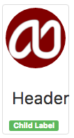
The children do not have to be Bootstrap controls. Here is a Thumbnail control, with a Label added as a child:
The following controls allow children: GridColumn, GridRow, Jumbotron, Media, Modal, Panel and Thumbnail.
Popovers and Tooltips
Most Bootstrap controls allow Popovers and Tooltips. They are specified at Design Time.
| Property | Description |
|---|---|
| popBody | Body of Popover. Not used for Tooltip. |
| popClose | How should it be opened and closed? Click, Focus or Hover. |
| popPosition | Position to display the Popover when hovering over the control. Top, Left, Right or Bottom. If 'none', the Popover will not appear. |
| popStyle | Tooltip (small) or Popover (larger)? |
| popTitle | Title of Popover or Tooltip. |
The following controls support Popovers and Tooltips: Breadcrumbs, Button, Checkbox, Dropdown, Image, Input, Listgroup, Pagination, Radiobutton, Select, Tabs and Textarea.
Themes
Bootstrap comes with 17 themes built into AppStudio. There is one theme per app: all controls use that theme. The BootstrapTheme is set in Project Properties.
If you change the theme of a project, the change will go into effect in the Design Screen next time it is reloaded.
Themes supported include: bootstrap, cerulean, cosmo, cyborg, darkly, flatly, journal, lumin, paper, readable, sandstone, simplex, slate, spacelab, superhero, united, yeti.
Visual Effects
Appearance
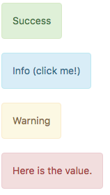
Many controls have an Appearance property. This sets the color of the control to one of a set of predefined colors, based on the urgency of the control. Appearances include default, primary, success, info, warning, danger and link.
Collapse
Each Bootstrap control has a collapse function. This toggles the control between visible and invisible. The position of other controls is automatically adjusted.
Panel1.collapse()


