// JavaScript
Jumbotron1.onclick = function() {
    NSB.MsgBox("You clicked Learn More!");
};
Jumbotron (Bootstrap): Difference between revisions
Jump to navigation
Jump to search
(Created page with "file:Bsjumbotron.png == Description == A lightweight, flexible component that can optionally extend the entire viewport to showcase key content on your site. It has a he...") |
No edit summary |
||
| (3 intermediate revisions by the same user not shown) | |||
| Line 22: | Line 22: | ||
| fullWidth || Should control be full width of screen? | | fullWidth || Should control be full width of screen? | ||
|- | |- | ||
| header || The main text. | | header || The main text. Can be HTML. | ||
|- | |- | ||
| icon || An icon to display on the control. | | icon || An icon to display on the control. | ||
| Line 30: | Line 30: | ||
| size || Large, medium, small or xsmall. | | size || Large, medium, small or xsmall. | ||
|- | |- | ||
| value || The sub text. Leave blank for none. | | value || The sub text. Leave blank for none. Can be HTML. | ||
|} | |} | ||
| Line 38: | Line 38: | ||
== Example == | == Example == | ||
<tabber> | |||
JavaScript= | |||
<syntaxhighlight lang="JavaScript"> | |||
// JavaScript | |||
Jumbotron1.onclick = function() { | |||
NSB.MsgBox("You clicked Learn More!"); | |||
}; | |||
</syntaxhighlight> | |||
|-| | |||
BASIC= | |||
<syntaxhighlight lang="vb.net"> | |||
' Basic | |||
Function Jumbotron1_onclick() | |||
MsgBox "You clicked Learn More!" | |||
End Function | |||
</syntaxhighlight> | |||
</tabber> | |||
== Output == | == Output == | ||
| Line 48: | Line 65: | ||
[[Category:Bootstrap]] | [[Category:Bootstrap]] | ||
Latest revision as of 14:45, 10 March 2019
Description
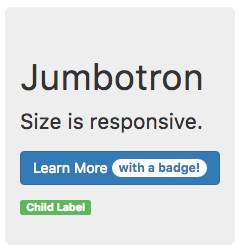
A lightweight, flexible component that can optionally extend the entire viewport to showcase key content on your site. It has a header, optional value and optional button.
It can also act as a container for child controls.
Properties and Methods
Standard properties are supported, plus:
| appearance | Appearance of the button. Can be success, info, warning, danger. |
| badge | Adds a Badge to the button. |
| buttonValue | The text of the button. If blank, there is no button. |
| ChangeForm | The form to change to if the button is clicked. |
| fullWidth | Should control be full width of screen? |
| header | The main text. Can be HTML. |
| icon | An icon to display on the control. |
| position | How will children be positioned? Absolute, fixed, relative or static. |
| size | Large, medium, small or xsmall. |
| value | The sub text. Leave blank for none. Can be HTML. |
Events
Standard events are supported.
Example
' Basic
Function Jumbotron1_onclick()
  MsgBox "You clicked Learn More!"
End Function
