Pageheader (Bootstrap): Difference between revisions
Jump to navigation
Jump to search
(Created page with "file:Bspageheader.png == Description == A simple shell for an h1 to appropriately space out and segment sections of content on a page. It can utilize the h1's default sm...") |
(→Output) |
||
| (4 intermediate revisions by the same user not shown) | |||
| Line 1: | Line 1: | ||
'''''This control is Bootstrap 3 only.''''' | |||
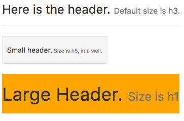
[[file:Bspageheader.png]] | [[file:Bspageheader.png]] | ||
== Description == | == Description == | ||
A simple shell for | A simple shell for a control to appropriately space out and segment sections of content on a page. It can utilize the control's default small element, as well as most other components (with additional styles). | ||
== Properties and Methods == | == Properties and Methods == | ||
| Line 11: | Line 14: | ||
|- | |- | ||
| badge || Adds a Badge to the control. | | badge || Adds a Badge to the control. | ||
|- | |||
| header || The text of the heading. | |||
|- | |- | ||
| size || The size of the text. Can be h1 (largest) to h5 (smallest). | | size || The size of the text. Can be h1 (largest) to h5 (smallest). | ||
|- | |- | ||
| value || The | | value || The text following the header. Leave blank for none. Design time or runtime. | ||
|- | |- | ||
| well || Display a border around the heading. | | well || Display a border around the heading. | ||
| Line 24: | Line 29: | ||
== Example == | == Example == | ||
None. | None. Pageheaders are simply passive text. | ||
== Output == | == Output == | ||
| Line 34: | Line 39: | ||
[[Category:Bootstrap]] | [[Category:Bootstrap]] | ||
Latest revision as of 14:20, 2 February 2019
This control is Bootstrap 3 only.
Description
A simple shell for a control to appropriately space out and segment sections of content on a page. It can utilize the control's default small element, as well as most other components (with additional styles).
Properties and Methods
Standard properties are supported, plus:
| badge | Adds a Badge to the control. |
| header | The text of the heading. |
| size | The size of the text. Can be h1 (largest) to h5 (smallest). |
| value | The text following the header. Leave blank for none. Design time or runtime. |
| well | Display a border around the heading. |
Events
Standard events are supported.
Example
None. Pageheaders are simply passive text.
