// JavaScript
Button1.onclick = function() {
OffCanvas1.toggle();
};
OffCanvas (Bootstrap 5)
Description
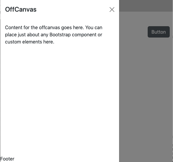
An OffCanvas control displays a panel of information over part of your your app. It can be positioned at the top, bottom, left or right. It can contain a header, detail or footers. By default, it is hidden, so it cannot be seen in the Design Screen. It needs to opened using its toggle function.
Since it does not display on the Design Screen, it can be difficult to edit. To add a control to a Modal, drag it anywhere onto the Design Screen. Then, in the Project Explorer, cut the new control and paste it into the Modal.
Make it the bottom control in the list of controls in the Project Explorer. That will it will float over the other controls without affecting their placement.
It can also act as a container for child controls.
Keep its width set to 'auto'. Bootstrap will size it properly. Do not set the screenMode of the containing Form to Zoom.
Modal Options
| backdrop | Includes a offcanvas-backdrop element. true/false/static (for a backdrop which doesn't close the offcanvas on click.) |
| focus | Puts the focus on the offcanvas when initialized. Default is true |
| keyboard | Closes the offcanvas when escape key is pressed. Default is true. If set to false, the close X does not appear. |
| show | Shows the offcanvas when initialized. Default is true |
Sample code to modify Modal Options:
  parms = {}
  parms.backdrop = "static"
  parms.keyboard = false
  parms.show = false
  $("#OffCanvas1").offcanvas(parms)
Sample code to modify the appearance of a Modal:
  tmp = OffCanvas1_header.innerHTML
  tmp = tmp.substr(0, tmp.indexOf("</h4>") + 5)
  OffCanvas1_header.innerHTML = tmp
  OffCanvas1_header.style.justifyContent = "center"
  OffCanvas1_title.style.textAlign = "center"
  OffCanvas1_body.style.alignSelf = "center"
Properties and Methods
Standard properties are supported, plus:
| footer | The text on the bottom. Leave blank for none. HTML is allowed. In Bootstrap 4, aligned right. Design Time and Runtime. |
| header | The heading in the control. Leave blank for none. HTML is allowed. Design Time and Runtime. |
| position | Where to show the control. Default is left. Can be left, right, top or bottom. |
| size | Size of Modal control. small, medium or large. |
| toggle() | Show or hide the Modal panel. |
| value | The text in the center of the control. Leave blank for none. HTML is allowed. In Bootstrap 4, text will scroll if needed. Design Time and Runtime. |
Events
Standard events are supported.
Example
' Basic
Function Button1_onclick()
  OffCanvas1.toggle()
End Function
