ScreenMode
ScreenMode is a form property which sets how a form will display on the screen at runtime. It has four settings:
Full Screen

Full screen is the default. It does not matter what you set the width and height to. When your app is run, the form will cover the whole screen.
This is the best setting if you are using Responsive Web Design or percentages to resize your app for different screen sizes.
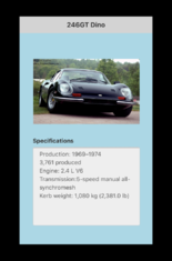
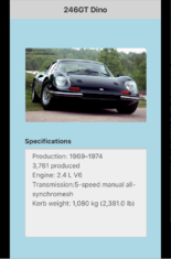
In these examples, we are showing a form designed for the iPhone 5, displayed on an iPhone 7.
Actual Size

The form is positioned at the left and top that you specify. Its size is determined by width and height.
Use this for modal forms and for panels which cover only part of the screen.
Center

The size of the form is set by the width and height. It is positioned in the middle of the screen.
This works best on devices which are a bit bigger than your form. Since the form is positioned dead center in the device, it looks like it was designed for it.
Keep in mind that the margins around the form will not be filled in. Add a background color (black always works!) to your Project Properties.
Zoom

The size of the form is set by the width and height, zoomed out to fit the actual size of the screen. The maximum it will zoom is two times. The form will be centered horizontally, with the top aligning with the top of the screen. Scrolling is enabled, so a portrait layout displayed on a landscape device can been seen completely.
Use this as a quick way to have your app adapt to any screen size.
Keep in mind that the margins around the form will not be filled in. Add a background color (black always works!) to your Project Properties.