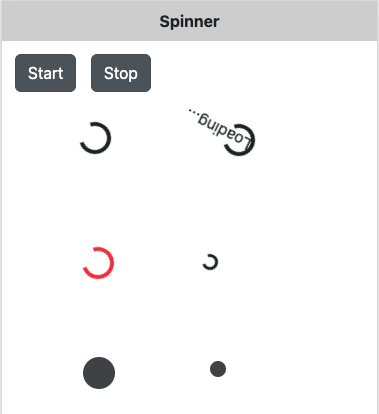
// JavaScript
Button1.onclick = function () {
  Spinner1.show();
};

Button2.onclick = function () {
  Spinner1.hide();
};
Spinner (Bootstrap)
Jump to navigation
Jump to search
Description
Indicate the loading state of a component or page.
Properties and Methods
Standard properties are supported, plus:
| bgColor | Show a standard spinner or a growing icon. |
| growing | Show a standard spinner or a growing icon. |
| showText | Show the text which spins along? |
| size | Default size, or a bit smaller |
| text | The text of the spinner. 'showText' turns it off. |
Events
Standard events are supported. For this control, the onclick event will be most useful.
Example
' Basic
Function Button1_onclick()
  Spinner1.show()
End Function

Function Button2_onclick()
  Spinner1.hide()
End Function
