Slider: Difference between revisions
Jump to navigation
Jump to search
No edit summary |
|||
| (10 intermediate revisions by 3 users not shown) | |||
| Line 1: | Line 1: | ||
[[file: | [[file:Slider.png]] | ||
== Description == | |||
''' | '''This control is part of iWebKit, which has been deprecated.''''' | ||
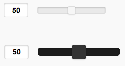
The Slider control allows the input of a range of values between min and max. It can be horizontal or vertical. The result is returned as a string in value.. | The Slider control allows the input of a range of values between min and max. It can be horizontal or vertical. The result is returned as a string in value.. | ||
The | The iWebKit version is supported starting with iOS 5. The iWebKit version not supported on Android. | ||
To add a control to your app, choose the control’s icon in the Toolbar, then position it on the Design Screen. Use the Property Editor to set the properties you need, then add functions to your code to respond to the events that come from the control: usually, just onclick. | To add a control to your app, choose the control’s icon in the Toolbar, then position it on the Design Screen. Use the Property Editor to set the properties you need, then add functions to your code to respond to the events that come from the control: usually, just onclick. | ||
== Properties == | |||
Standard [[properties]] are supported, plus: | Standard [[properties and methods|properties]] are supported, plus: | ||
{| class="wikitable" | {| class="wikitable" | ||
|- | |- | ||
| Line 22: | Line 22: | ||
| max || The maximum value. Integer. Default is 100. | | max || The maximum value. Integer. Default is 100. | ||
|- | |- | ||
| orientation || Horizontal or vertical. ( | | orientation || Horizontal or vertical. (iWebKit only) | ||
|- | |- | ||
| setValue || Set the value of the slider ( | | setValue || Set the value of the slider (jQuery Mobile) | ||
|- | |- | ||
| step || Increment steps between min and max. Integer. Default is 50. | | step || Increment steps between min and max. Integer. Default is 50. | ||
|} | |} | ||
== Events == | |||
Standard [[events]] are supported. | Standard [[events]] are supported. | ||
== Example == | |||
<pre> | <pre> | ||
| Line 43: | Line 43: | ||
Text1.value="Slider 2 changed to " & Slider2.value | Text1.value="Slider 2 changed to " & Slider2.value | ||
End Function | End Function | ||
'Change the color of the background at runtime | |||
$(Slider1).css("background-color","red") | |||
'Change the color of the track | |||
$(Slider1).find(".ui-slider-track").css("background-color","red") | |||
'Change the color of the slider | |||
$(Slider1).find(".ui-slider-handle").css("background-color","blue") | |||
</pre> | </pre> | ||
== Output == | |||
<pre> | <pre> | ||
“Slider 2 changed to 2” | “Slider 2 changed to 2” | ||
</pre> | </pre> | ||
[[Category:Language Reference]] | |||
[[Category:Controls]] | |||
[[Category:jQuery Mobile]] | |||
[[Category:iWebKit]] | |||
Latest revision as of 14:40, 25 January 2021
Description
This control is part of iWebKit, which has been deprecated.
The Slider control allows the input of a range of values between min and max. It can be horizontal or vertical. The result is returned as a string in value..
The iWebKit version is supported starting with iOS 5. The iWebKit version not supported on Android.
To add a control to your app, choose the control’s icon in the Toolbar, then position it on the Design Screen. Use the Property Editor to set the properties you need, then add functions to your code to respond to the events that come from the control: usually, just onclick.
Properties
Standard properties are supported, plus:
| value | The value of the control. |
| min | The minimum value. Integer. Default is 0. |
| max | The maximum value. Integer. Default is 100. |
| orientation | Horizontal or vertical. (iWebKit only) |
| setValue | Set the value of the slider (jQuery Mobile) |
| step | Increment steps between min and max. Integer. Default is 50. |
Events
Standard events are supported.
Example
Function Slider1_onchange()
  Text1.value="Slider 1 changed to " & Slider1.value
End Function

Function Slider2_onchange()
  Text1.value="Slider 2 changed to " & Slider2.value
End Function

'Change the color of the background at runtime
$(Slider1).css("background-color","red")

'Change the color of the track
$(Slider1).find(".ui-slider-track").css("background-color","red")

'Change the color of the slider
$(Slider1).find(".ui-slider-handle").css("background-color","blue")
Output
“Slider 2 changed to 2”
