Modal Forms: Difference between revisions
No edit summary |
No edit summary |
||
| (8 intermediate revisions by 2 users not shown) | |||
| Line 6: | Line 6: | ||
<pre> | <pre> | ||
modal: True | modal: True | ||
screenMode: Actual Size | |||
left: | left: (value does not matter - form will be centered) | ||
top: | top: (value does not matter - form will be centered) | ||
width: | width: (pixels, percentages or 'auto') | ||
height: | height: (pixels, percentages or 'auto') | ||
style: padding:5px; (optional - this tightens up the padding around the form) | |||
</pre> | </pre> | ||
At runtime, show and hide modal forms like any other form: | At runtime, show and hide modal forms like any other form: | ||
| Line 20: | Line 20: | ||
Form _onshow() and _onhide functions will be called (if they exist). [[NSBCurrentForm|NSB.currentForm]] will be set to the modal form. | Form _onshow() and _onhide functions will be called (if they exist). [[NSBCurrentForm|NSB.currentForm]] will be set to the modal form. | ||
There are a number of options you can set when opening a modal form. Set these using object syntax: inside {} braces, put key, value pairs. For example, to fade in the modal form over 1 second | There are a number of options you can set when opening a modal form. Set these using object syntax: inside {} braces, put key, value pairs. For example, to fade in the modal form over 1 second, do this: | ||
<pre> | <pre> | ||
Modal1.show({fadeDuration: 1000 | Modal1.show({fadeDuration: 1000}) | ||
</pre> | </pre> | ||
Here are the settings you can use while opening a modal form: | Here are the settings you can use while opening a modal form (values listed below are the defaults): | ||
{| class='wikitable' | {| class='wikitable' | ||
|- | |- | ||
| | |closeExisting || true || Close existing modals. Set this to false if you need to stack multiple modal instances. | ||
|- | |- | ||
|escapeClose || true || Allows the user to close the modal by pressing `ESC` | |escapeClose || true || Allows the user to close the modal by pressing `ESC` | ||
| Line 55: | Line 51: | ||
|fadeDelay || 1.0 || Point during the overlay's fade-in that the modal begins to fade in (.5 = 50%, 1.5 = 150%, etc.) | |fadeDelay || 1.0 || Point during the overlay's fade-in that the modal begins to fade in (.5 = 50%, 1.5 = 150%, etc.) | ||
|} | |} | ||
The jQuery Mobile [[Select]] control requires a higher value for zIndex - set it to 99999. | |||
Latest revision as of 14:58, 16 June 2017
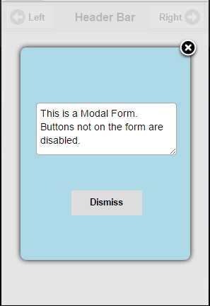
Modal Forms are forms which float over the rest of your app. Until the modal form is dismissed, the controls on the form behind it cannot be accessed. AppStudio uses the jQuery Modal library. It is included in AppStudio apps already, so nothing needs to be done to use it.
Any form can be made modal. To make a form modal, a few form properties need to be set:
  modal: True
  screenMode: Actual Size
  left: (value does not matter - form will be centered)
  top: (value does not matter - form will be centered)
  width: (pixels, percentages or 'auto')
  height: (pixels, percentages or 'auto')
  style: padding:5px; (optional - this tightens up the padding around the form)
At runtime, show and hide modal forms like any other form:
Modal1.show()
Form _onshow() and _onhide functions will be called (if they exist). NSB.currentForm will be set to the modal form.
There are a number of options you can set when opening a modal form. Set these using object syntax: inside {} braces, put key, value pairs. For example, to fade in the modal form over 1 second, do this:
Modal1.show({fadeDuration: 1000})
Here are the settings you can use while opening a modal form (values listed below are the defaults):
| closeExisting | true | Close existing modals. Set this to false if you need to stack multiple modal instances. |
| escapeClose | true | Allows the user to close the modal by pressing `ESC` |
| clickClose | true | Allows the user to close the modal by clicking the overlay |
| closeText | 'Close' | Text content for the close <a> tag. |
| closeClass | Add additional class(es) to the close <a> tag. | |
| showClose | true | Shows a (X) icon/link in the top-right corner |
| modalClass | "modal" | CSS class added to the element being displayed in the modal. |
| spinnerHtml | null | HTML appended to the default spinner during AJAX requests. |
| showSpinner | true | Enable/disable the default spinner during AJAX requests. |
| fadeDuration | null | Number of milliseconds the fade transition takes (null means no transition) |
| fadeDelay | 1.0 | Point during the overlay's fade-in that the modal begins to fade in (.5 = 50%, 1.5 = 150%, etc.) |
The jQuery Mobile Select control requires a higher value for zIndex - set it to 99999.
