JqxDateTimeInput: Difference between revisions
Jump to navigation
Jump to search
No edit summary |
|||
| Line 1: | Line 1: | ||
[[File:Jqxdatetimeinput.png]] | [[File:Jqxdatetimeinput.png]] | ||
== Description == | == Description == | ||
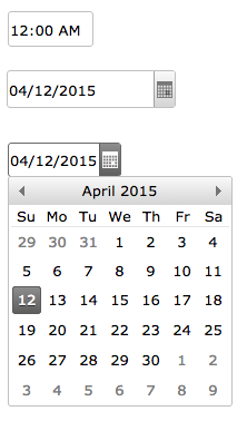
jqxDateTimeInput represents a highly configurable widget for displaying and selecting date and time values by using a popup Calendar display or by keyboard input into the text field. | |||
jqWidgets is a commercial product, which depending on how you use it, requires a license fee. | jqWidgets is a commercial product, which depending on how you use it, requires a license fee. | ||
Revision as of 17:57, 12 April 2015
Description
jqxDateTimeInput represents a highly configurable widget for displaying and selecting date and time values by using a popup Calendar display or by keyboard input into the text field.
jqWidgets is a commercial product, which depending on how you use it, requires a license fee. Complete details are on jqWidget's website. The product is well supported.
Properties and Methods
See the complete documentation at jqWidget's site: http://www.jqwidgets.com/jquery-widgets-documentation/documentation/jqxcalendar/jquery-calendar-getting-started.htm
| closeCalendarAfterSelection | Close Calendar after selection has been done. |
| dropDownHorizontalAlignment | Calendar alignment. |
| enableBrowserBoundsDetection | Close Calendar after selection has been done. |
| formatString | Date or time format. Use t for time. See jqWidgets docs for all the options. |
| name | Key in submitted form |
| selectionMode | Sets or gets the dropdown calendar's selection mode. |
| showCalendarButton | Show the Calendar button. |
| showFooter | Sets a value indicating whether the calendar's footer is displayed. |
| style | Styling rules for element |
Example (Basic)
Example (JavaScript)
Output
See above.
