Input (Bootstrap): Difference between revisions
Jump to navigation
Jump to search
| Line 47: | Line 47: | ||
| header || An optional message at the bottom of the list of items. Design Time and Runtime. | | header || An optional message at the bottom of the list of items. Design Time and Runtime. | ||
|- | |- | ||
| | | headerCols || Width to be allocated to the header. Can be from 0 to 12. Default is 2. headerCols + valueCols must equal 12. | ||
|- | |- | ||
| inputType || Specifies what kind of data will be input. Choices are color, date, datetime, email, file (iOS 6+ and Android 4+ only), hidden, month, number, password, range, search, tel, text, time and url. Default is text. | | icon || An optional [http://fontawesome.io/] to appear at the right of the input field. Design Time and Runtime. | ||
|- | |||
| inputType || Specifies what kind of data will be input. Choices are color, date, datetime, email, file (iOS 6+ and Android 4+ only), hidden, month, number, password, range, search, tel, text, time and url. Default is text. Not all browsers support all types. Design time. | |||
|- | |||
| leftText || Text to appear in the left side of the input box. Does not display if container < 768 pixels. | |||
|- | |- | ||
| max || If inputType is numeric, the maximum allowed value. For date, the latest date in the format YYYY-MM-DD. | | max || If inputType is numeric, the maximum allowed value. For date, the latest date in the format YYYY-MM-DD. | ||
| Line 70: | Line 74: | ||
|- | |- | ||
| value || Gets or sets the value (true or false) of line i. Runtime. | | value || Gets or sets the value (true or false) of line i. Runtime. | ||
|- | |||
| valueCols || Width to be allocated to the value. Can be from 0 to 12. Default is 10. headerCols + valueCols must equal 12. | |||
|} | |} | ||
Revision as of 10:42, 1 December 2016
Description
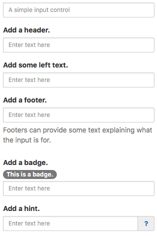
The Input control allows a single line of input text. It has optional headers, footers and other features.
To disable an Input at runtime, do the following:
Input1_contents.disabled = true
To highlight an Input control with an error (and return it to normal):
  $("#Input1").addClass("has-error")
  $("#Input1").removeClass("has-error")
To hide and show the Help text:
  $("#Input1 .help-block").addClass("hidden")
  $("#Input1 .help-block").removeClass("hidden")
Popovers and Tooltips are supported.
Properties and Methods
Standard properties are supported, plus:
| autocapitalize | Automatically capitalize first letter? May not be available on other platforms. |
| autocomplete | Automatically complete words? May not be available on other platforms. |
| autocorrect | Spellcheck as entering? May not be available on other platforms. |
| badge | Adds a Badge to the control. Design Time and Runtime. |
| files | Array of files chosen if inputType is 'file'. Runtime. |
| focus() | Sets the focus to the TextBox. Runtime only. |
| footer | An optional message at the bottom of the list of items. Design Time and Runtime. |
| header | An optional message at the bottom of the list of items. Design Time and Runtime. |
| headerCols | Width to be allocated to the header. Can be from 0 to 12. Default is 2. headerCols + valueCols must equal 12. |
| icon | An optional [1] to appear at the right of the input field. Design Time and Runtime. |
| inputType | Specifies what kind of data will be input. Choices are color, date, datetime, email, file (iOS 6+ and Android 4+ only), hidden, month, number, password, range, search, tel, text, time and url. Default is text. Not all browsers support all types. Design time. |
| leftText | Text to appear in the left side of the input box. Does not display if container < 768 pixels. |
| max | If inputType is numeric, the maximum allowed value. For date, the latest date in the format YYYY-MM-DD. |
| maxlength | Maximum number of input characters. Does not apply to numeric: use max instead. |
| min | If inputType is numeric, the minimum allowed value. For date, the earliest date in the format YYYY-MM-DD. |
| placeholder | Text to be displayed in the field just as a comment – does not change the value. |
| readonly | If set to “True”, the control cannot be edited. At runtime, use readOnly. |
| required | If set to “True”, the field requires a value when the form is submitted. Design time only. |
| setSelectionRange(start, end) | Selects a range of characters. The first character starts at 0. Runtime only. |
| size | Size of input text: small or large. Header and footer size is controlled by fontSize. Design time only. |
| step | For numeric inputType: value must be a multiple of step. Use 1 for integer only. |
| value | Gets or sets the value (true or false) of line i. Runtime. |
| valueCols | Width to be allocated to the value. Can be from 0 to 12. Default is 10. headerCols + valueCols must equal 12. |
Events
Standard events are supported. For this control, the onfocusout event will be useful. It gets called when the user changes the focus to another field.
Example (Basic)
Call a function when user is done editing field.
Function Input1_onfocusout()
  MsgBox "Value is " & Input1.value
End Function
Example (JavaScript)
Call a function when user is done editing field.
Input1.onfocusout = function() {
    NSB.MsgBox("Value is " + Input1.value);
};
