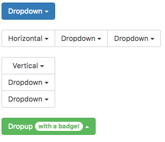
Dropdown (Bootstrap): Difference between revisions
Jump to navigation
Jump to search
| Line 27: | Line 27: | ||
|- | |- | ||
| grouping || Is this control part of a group? Choices are No, Start Horizontal, Start Vertical, Middle and End. | | grouping || Is this control part of a group? Choices are No, Start Horizontal, Start Vertical, Middle and End. | ||
|- | |||
| filter || Display a textbox to input a filter for items to display (Bootstrap 4). | |||
|- | |||
| filterPlaceholder || Prompt for filter textbox. (Bootstrap 4) | |||
|- | |- | ||
| groupStyle || The styling to apply to the entire group. | | groupStyle || The styling to apply to the entire group. | ||
Revision as of 11:56, 19 September 2018
Description
Toggleable, contextual menu for displaying lists of links.
When the control is created, selection is set to undefined.
Two onclick events happen when a Dropdown is clicked. When the control is initially clicked, an event is sent. When the user makes a selection, onclick is called again with the text of the selection.
Popovers and Tooltips are supported.
Properties and Methods
Standard properties are supported, plus:
| addItem(item, type) | Adds an item to the end. type can be "divider", "checked" or "disabled" . Runtime. |
| appearance | Appearance of the alert. Can be success, info, warning, danger. |
| badge | Adds a Badge to the control. Design Time and Runtime. |
| clear() | Clears all items. Runtime. |
| enable([index,]bool) | Enables and disables items. Index can be an item or an array of items. If no index supplied, all items are affected. Bool is true or false. Runtime only. |
| grouping | Is this control part of a group? Choices are No, Start Horizontal, Start Vertical, Middle and End. |
| filter | Display a textbox to input a filter for items to display (Bootstrap 4). |
| filterPlaceholder | Prompt for filter textbox. (Bootstrap 4) |
| groupStyle | The styling to apply to the entire group. |
| icon | An optional icon to appear at the top of the list. Design Time and Runtime. |
| items | Items to show, one per line. Prefix * for disabled, > for selected, ! for heading (not all controls support headings). Just a "-" draws a line between the items. Design Time. |
| length | Current number of items. Runtime. |
| selection | Get the value of the selection (after an item is selected). Runtime. |
| value | Get or Set the title of the dropdown button. Runtime. |
Events
Standard events are supported. For this control, the onclick event will be most useful.
Example (Basic)
Ignore the event when the Dropdown is first clicked, and handle the event when a selection is made.
Function Dropdown1_onclick(s)
  If typeof(s)="object" Then return
  MsgBox s & " " & Dropdown1.selection
End Function
Example (JavaScript)
Ignore the event when the Dropdown is first clicked, and handle the event when a selection is made.
Dropdown1.onclick = function(s) {
    if (typeof(s) == "object") {
        return;
    }
    NSB.MsgBox(s + " " + Dropdown1.selection);
};
