// JavaScript
Button1.onclick = function() {
NSB.MsgBox("You can display a message or take other action when clicked");
};
Button (Bootstrap): Difference between revisions
Added information about positioning icons in bootstrap buttons |
|||
| Line 28: | Line 28: | ||
[[Introduction_to_Bootstrap#Popovers_and_Tooltips|Popovers and Tooltips]] are supported. | [[Introduction_to_Bootstrap#Popovers_and_Tooltips|Popovers and Tooltips]] are supported. | ||
When adding icons to buttons, icons will display to the left of the button text by default. Helper classes can be added to the button's class and value properties to place the icon to the right of the text. | |||
'''In Bootstrap 3:''' Add span with a class of .pull-left to the button's value property. You can add a non-breaking space to add room between the icon and the button text. | |||
<pre> | |||
Button1.value = "<span class="pull-left"> Example Button Text</span></pre> | |||
'''In Bootstrap 4 and Bootstrap 5:''' Add Bootstrap's .d-flex and .flex-row-reverse to the buttons class property. Use Bootstrap's justify and align classes to modify the placement of the button text and icon within the button (e.g., use justify-content-center to center the text and icon). Add space between the button text and icon by adding a span around the text in the button's value property and using Bootstrap's spacing helper classes (e.g., mr-1, mr-2, mr-3, etc.) to add a margin to the right side of the button's text. | |||
<pre> | |||
Button1.class = "d.flex flex-row-reverse justify-content-center" | |||
Button1.value = "<span class="mr-2">Example Button Text</span>" | |||
</pre> | |||
== Properties and Methods == | == Properties and Methods == | ||
Revision as of 03:56, 5 March 2024
Description
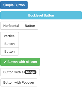
Buttons can be clicked on by users to initiate actions.
By setting the appearance, buttons can have different colors.
Buttons can be grouped into horizontal and vertical groups.
The color of a Bootstrap button is set by its appearance property. Possible values are
default, primary, success, info, warning, danger and link
To change a button from primary to danger, do this:
$( "#Button6" ).removeClass( "btn-primary" );
$( "#Button6" ).addClass( "btn-danger" );
The colors for each of each of the appearance settings is defined in the Bootstrap them you use. This provides your app with a consistant look and feel throughout.
To change the icon and text at runtime, do this:
Button1.innerHTML = "<span id='Button1_icon' class='fa fa-bus'></span> Button"
Button1_icon.title = "New Title"
Popovers and Tooltips are supported.
When adding icons to buttons, icons will display to the left of the button text by default. Helper classes can be added to the button's class and value properties to place the icon to the right of the text.
In Bootstrap 3: Add span with a class of .pull-left to the button's value property. You can add a non-breaking space to add room between the icon and the button text.
Button1.value = "<span class="pull-left"> Example Button Text</span>
In Bootstrap 4 and Bootstrap 5: Add Bootstrap's .d-flex and .flex-row-reverse to the buttons class property. Use Bootstrap's justify and align classes to modify the placement of the button text and icon within the button (e.g., use justify-content-center to center the text and icon). Add space between the button text and icon by adding a span around the text in the button's value property and using Bootstrap's spacing helper classes (e.g., mr-1, mr-2, mr-3, etc.) to add a margin to the right side of the button's text.
Button1.class = "d.flex flex-row-reverse justify-content-center"
Button1.value = "<span class="mr-2">Example Button Text</span>"
Properties and Methods
Standard properties are supported, plus:
| appearance | Appearance of the alert. For example: success, info, warning, danger. |
| badge | Adds a Badge to the alert. |
| blocklevel | Make the button full width of parent? |
| ChangeForm | id of the form to change to if clicked. Optional. |
| grouping | Is this button part of a group? Choices are No, Start Horizontal, Start Vertical, Middle and End. |
| groupStyle | The styling to apply to the entire group. |
| icon | Optional. Icon to put at right of control. Bootstrap 3 uses the Font Awesome set. Examples: trash, check. Bootstrap 4 uses Open Iconic. Examples trash, check, circle-check. |
| iconTitle | Optional. Text to display when hovering cursor over icon. Bootstrap 4. |
| Outline | Display button with an outline, instead of solid color. Bootstrap 4. |
| toggleControl | Supply the name of another control here, like a Card or Image. Clicking the button will show or hide the other control. |
| size | The size of the button. Can be large, medium, small or extra small (Bootstrap 3 only). |
| value | The title of the button. Design time or runtime. |
| hide() | Hide the button. Runtime. |
| show() | Show the button. Runtime. |
Events
Standard events are supported. For this control, the onclick event will be most useful.
Example
' Basic
Function Button1_onclick()
  MsgBox "You can display a message or take other action when clicked"
End Function
