// JavaScript
Alert1.onclick = function() {
  NSB.MsgBox("You can display a message or take other action when clicked");
};
Spinner (Bootstrap): Difference between revisions
Jump to navigation
Jump to search
Created page with "file:Bsalert.png == Description == Provide contextual feedback messages for typical user actions with the handful of available and flexible alert messages. By setting the appearance, alerts can have different colors. Turning dismissable on will add an x to the control. Clicking on it will cause the alert to be hidden, and your app will reformat to use the space which has been freed up. == Properties and Methods == Standard properties a..." |
No edit summary |
||
| Line 1: | Line 1: | ||
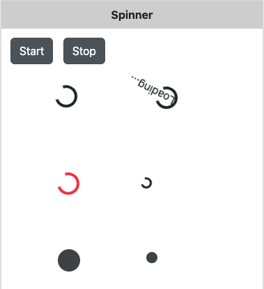
[[ | [[File:Spinner.png]] | ||
== Description == | == Description == | ||
Indicate the loading state of a component or page. | |||
== Properties and Methods == | == Properties and Methods == | ||
| Line 12: | Line 11: | ||
{| class="wikitable" | {| class="wikitable" | ||
|- | |- | ||
| | | bgColor || Show a standard spinner or a growing icon. | ||
|- | |- | ||
| | | growing || Show a standard spinner or a growing icon. | ||
|- | |- | ||
| | | showText || Show the text which spins along? | ||
|- | |- | ||
| | | size || Default size, or a bit smaller | ||
|- | |||
| text || The text of the spinner. 'showText' turns it off. | |||
|} | |} | ||
Revision as of 18:00, 30 October 2024
Description
Indicate the loading state of a component or page.
Properties and Methods
Standard properties are supported, plus:
| bgColor | Show a standard spinner or a growing icon. |
| growing | Show a standard spinner or a growing icon. |
| showText | Show the text which spins along? |
| size | Default size, or a bit smaller |
| text | The text of the spinner. 'showText' turns it off. |
Events
Standard events are supported. For this control, the onclick event will be most useful.
Example
' Basic
FFunction Alert2_onclick()
  MsgBox "You can display a message or take other action when clicked"
End Function
