Checkbox (Bootstrap): Difference between revisions
Jump to navigation
Jump to search
No edit summary |
|||
| Line 12: | Line 12: | ||
{| class="wikitable" | {| class="wikitable" | ||
|- | |- | ||
| badge || Adds a Badge to the | | addItem(''item'', ''type'') || Adds an ''item'' to the end. ''type'' can be "checked" or "disabled" . Runtime. | ||
|- | |||
| badge || Adds a Badge to the control. Design Time and Runtime. | |||
|- | |||
| clear || Clears all items. Runtime. | |||
|- | |- | ||
| footer || An optional message at the bottom of the list of items. Design Time and Runtime. | | footer || An optional message at the bottom of the list of items. Design Time and Runtime. | ||
|- | |||
| getValue(i) || Get the value (true or false) of line i. Runtime. | |||
|- | |- | ||
| header || An optional message at the bottom of the list of items. Design Time and Runtime. | | header || An optional message at the bottom of the list of items. Design Time and Runtime. | ||
| Line 25: | Line 31: | ||
|- | |- | ||
| length || Items to show, one per line. Prefix * for disabled, > for selected, ! for heading (not all controls support headings). Design Time. | | length || Items to show, one per line. Prefix * for disabled, > for selected, ! for heading (not all controls support headings). Design Time. | ||
|- | |||
| setValue(i) || Set the value (true or false) of line i. Runtime. | |||
|} | |} | ||
Revision as of 15:11, 4 June 2016
Description
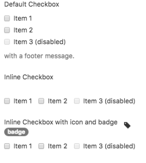
The Checkbox allows users to select a binary option from a list of one or more items.
Popovers and Tooltips are supported.
Properties and Methods
Standard properties are supported, plus:
| addItem(item, type) | Adds an item to the end. type can be "checked" or "disabled" . Runtime. |
| badge | Adds a Badge to the control. Design Time and Runtime. |
| clear | Clears all items. Runtime. |
| footer | An optional message at the bottom of the list of items. Design Time and Runtime. |
| getValue(i) | Get the value (true or false) of line i. Runtime. |
| header | An optional message at the bottom of the list of items. Design Time and Runtime. |
| icon | An optional icon to appear at the top of the list. Design Time and Runtime. |
| inline | Display items horizontally? Design Time. |
| items | Items to show, one per line. Prefix * for disabled, > for selected, ! for heading (not all controls support headings). Design Time. |
| length | Items to show, one per line. Prefix * for disabled, > for selected, ! for heading (not all controls support headings). Design Time. |
| setValue(i) | Set the value (true or false) of line i. Runtime. |
Events
Standard events are supported. For this control, the onclick event will be most useful.
Example (Basic)
Go through all the checkboxes and see which ones have been chosen.
Function Checkbox1_onclick()
  Dim choices = "Choices: "
  For i = 0 To Checkbox1.length-1
    If Checkbox1.getValue(i) Then choices = choices & i & " "
  Next
  MsgBox choices
End Function
Example (JavaScript)
Go through all the checkboxes and see which ones have been chosen.
Checkbox1.onclick = function() {
    var choices = "Choices: ";
    for (i = 0; i <= Checkbox1.length - 1; i++) {
        if (Checkbox1.getValue(i)) {
            choices = choices + i + " ";
        }
    }
    NSB.MsgBox(choices);
};
