Modal (Bootstrap): Difference between revisions
Jump to navigation
Jump to search
No edit summary |
No edit summary |
||
| Line 3: | Line 3: | ||
== Description == | == Description == | ||
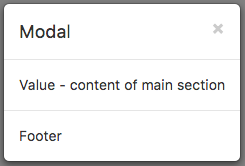
A Modal control displays a panel of information above your app. It can contain a header, detail or footers. By default, it is hidden, so it cannot be seen in the Design Screen. It needs to opened using | |||
<pre> | |||
$("#Modal1").modal("toggle") | |||
</pre> | |||
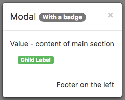
It can also act as a container for child controls. | It can also act as a container for child controls. | ||
| Line 12: | Line 15: | ||
{| class="wikitable" | {| class="wikitable" | ||
|- | |- | ||
| | | badge || Adds a Badge to the control. Design Time and Runtime. | ||
|- | |- | ||
| | | footer || The text on the bottom. Leave blank for none. Design Time and Runtime. | ||
|- | |- | ||
| | | footerAlign || Alignment of footer contents. left, center or right. Design time. | ||
|- | |- | ||
| | | header || The heading in the control. Leave blank for none. Design Time and Runtime. | ||
|- | |- | ||
| | | size || Size of Modal control. small, medium or large. | ||
|- | |- | ||
| | | toggle() || Show or hide the Model panel. | ||
- | |||
| value || The text in the center of the control. Leave blank for none. Design Time and Runtime. | |||
| value || The | |||
|} | |} | ||
Revision as of 20:21, 5 June 2016
Description
A Modal control displays a panel of information above your app. It can contain a header, detail or footers. By default, it is hidden, so it cannot be seen in the Design Screen. It needs to opened using
$("#Modal1").modal("toggle")
It can also act as a container for child controls.
Properties and Methods
Standard properties are supported, plus:
| badge | Adds a Badge to the control. Design Time and Runtime. | ||
| footer | The text on the bottom. Leave blank for none. Design Time and Runtime. | ||
| footerAlign | Alignment of footer contents. left, center or right. Design time. | ||
| header | The heading in the control. Leave blank for none. Design Time and Runtime. | ||
| size | Size of Modal control. small, medium or large. | ||
| toggle() | Show or hide the Model panel.
- |
value | The text in the center of the control. Leave blank for none. Design Time and Runtime. |
Events
Standard events are supported.
Example (BASIC)
Function Media1_onclick()
  MsgBox "Media1 clicked!"
End Function
Example (JavaScript)
Media1.onclick = function() {
    NSB.MsgBox("Media1 clicked!");
};

