JqxChart: Difference between revisions
Jump to navigation
Jump to search
| Line 125: | Line 125: | ||
Chart1.resize(100,100,600,400) | Chart1.resize(100,100,600,400) | ||
$("#Chart1").jqxChart("refresh") | $("#Chart1").jqxChart("refresh") | ||
</pre> | |||
<pre> | |||
Function Form1_onresize() | |||
$("#Chart2").jqxChart("refresh") | |||
End Function | |||
</pre> | </pre> | ||
Revision as of 09:26, 5 April 2017
Description
jqxChart is an easy to use chart widget based on the popular jQuery library.
jqWidgets is a commercial product, which depending on how you use it, requires a license fee. Complete details are on jqWidget's website. The product is well supported.
jqxChart supports several common chart types. You can easily plot series of different types on a common chart. A type must be specified for each series group. Currently jqxChart supports the following series types:
- column - simple column series
- stackedcolumn - stacked column series
- stackedcolumn100 - percentage stacked columns
- line - simple streight lines connecting the value points
- stackedline - stacked lines
- stackedline100 - percentage stacked lines
- spline - smooth lines connecting the value points
- stackedspline - smooth stacked lines
- stackedspline100 - percentage stacked smooth lines
- area - area connecting the value points with streight lines
- stackedarea- stacked area with streight lines between the points
- stackedline100 - percentage stacked area
- areaspline - smooth area connecting the value points
- stackedareaspline - smooth stacked areas
- stackedareaspline100 - percentage stacked smooth area
- pie - circular chart divided into sectors, illustrating proportion
- scatter - data is displayed as a collection of points
- bubble - data is displayed as a collection of bubbles
Properties and Methods
This control is well documented on the jqWidget's website: http://www.jqwidgets.com/jquery-widgets-documentation/.
Example (JavaScript)
function Button1_onclick() {
  //Render the chart.
  $("#Chart2").jqxChart(Chart2_settings);
}

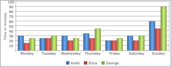
var  sampleData = [
      { Day:'Monday', Keith:30, Erica:15, George: 25},
      { Day:'Tuesday', Keith:25, Erica:25, George: 30},
      { Day:'Wednesday', Keith:30, Erica:20, George: 25},
      { Day:'Thursday', Keith:35, Erica:25, George: 45},
      { Day:'Friday', Keith:20, Erica:20, George: 25},
      { Day:'Saturday', Keith:30, Erica:20, George: 30},
      { Day:'Sunday', Keith:60, Erica:45, George: 90}
  ];

Chart2_settings.source = sampleData;
Chart2_settings.categoryAxis = {
            dataField: 'Day',
            showGridLines: false};
Chart2_settings.seriesGroups =
        [
            {
                type: 'column',
                columnsGapPercent: 30,
                seriesGapPercent: 0,
                valueAxis:
                {
                    minValue: 0,
                    maxValue: 100,
                    unitInterval: 10,
                    description: 'Time in minutes'
                },
                series: [
                        { dataField: 'Keith', displayText: 'Keith'},
                        { dataField: 'Erica', displayText: 'Erica'},
                        { dataField: 'George', displayText: 'George'}
                    ]
            }
        ]
Example (BASIC)
Dim sampleData, row

Function Button1_onclick()
  'Render the chart.
  $("#Chart1").jqxChart(Chart1_settings)
End Function

Function Form1_onshow()
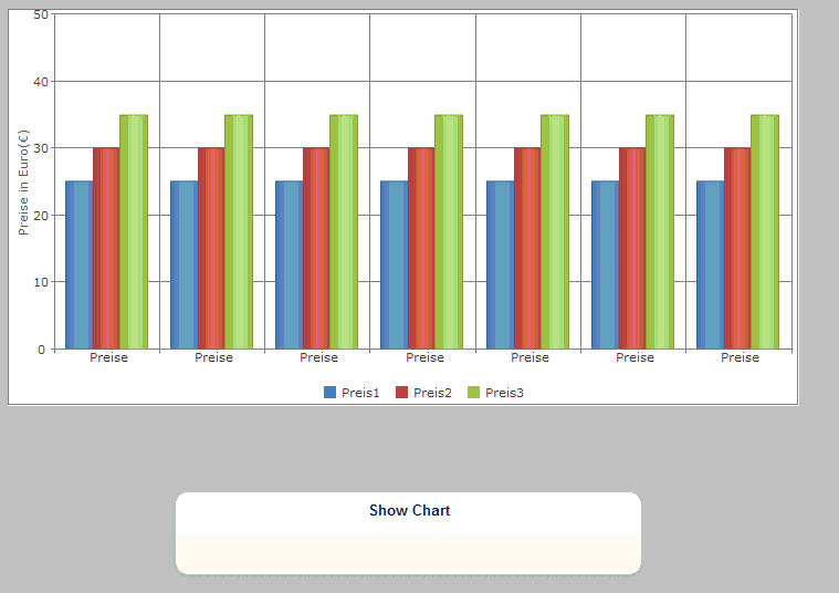
  sampleData = []
  For i=0 To 6
    row=[]
    row["id"] = "Preise"
    row["Preis1"] = 25
    row["Preis2"] = 30
    row["Preis3"] = 35
    sampleData[i]= row
  Next

  Chart1_settings.source = sampleData
  Chart1_settings.categoryAxis={dataField:"id", showGridLines:True}
  Chart1_settings.seriesGroups = [ _
    { _
    type: "column", _
    columnsGapPercent: 30, _
    seriesGapPercent: 0, _
          valueAxis: _
          { _
          minValue: 0, _
          maxValue: 50, _
          unitInterval: 10, _
          description: "Preise in Euro(€)" _
          }, _
            series:[ _
                    { dataField: "Preis1", displayText: "Preis1"}, _
                    { dataField: "Preis2", displayText: "Preis2"}, _
                    { dataField: "Preis3", displayText: "Preis3"} _
                    ] _
    } _
    ]

End Function
To resize a chart:
  Chart1.resize(100,100,600,400)
  $("#Chart1").jqxChart("refresh")
Function Form1_onresize()
  $("#Chart2").jqxChart("refresh")
End Function

