Select (Bootstrap): Difference between revisions
Jump to navigation
Jump to search
| Line 10: | Line 10: | ||
'''Note''': Changes were made to the Bootstrap 4 version of this control, starting with AppStudio 7.2. | '''Note''': Changes were made to the Bootstrap 4 version of this control, starting with AppStudio 7.2. | ||
* .addItem changed from(item, type) to ( | * .''addItem'' changed from(''item'', ''type'') to (''text'', ''value'', ''selected'', ''disabled'') | ||
* .value renamed to .item | * .''value'' renamed to .''item'' | ||
* .value now saves the internal value for the item. | * .''value'' now saves the internal value for the item. | ||
== Properties and Methods == | == Properties and Methods == | ||
Revision as of 22:56, 14 January 2019
Description
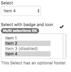
Provides a popdown list of items which can be selected. Multiple selections are allowed.
Compared the Dropdown control, it acts more like other Input controls, with a header and a footer. Dropdown acts more like a button and does not allow multiple selections.
Popovers and Tooltips are supported.
Note: Changes were made to the Bootstrap 4 version of this control, starting with AppStudio 7.2.
- .addItem changed from(item, type) to (text, value, selected, disabled)
- .value renamed to .item
- .value now saves the internal value for the item.
Properties and Methods
Standard properties are supported, plus:
| addItem(item, type) | Adds an item to the end. type can be "selected" or "disabled" . Runtime. |
| badge | Adds a Badge to the control. Design Time and Runtime. |
| clear | Clears all items. Runtime. |
| icon | An optional icon to appear at the top of the list. Design Time and Runtime. |
| items | Items to show, one per line. Prefix * for disabled, > for selected, ! for heading (not all controls support headings). Design Time. |
| multiSelect | Can multiple items be selected? Design Time. |
| length | Current number of items. Runtime. |
| size | Maximum number of rows to display. Default is 1 (4 if multiSelect). Design Time. |
| text | Gets or sets the text of the current selection. If setting, the text needs to exist as a choice already. If multiple selected, value returns an array. Run Time. |
| value | Gets or sets the current selection. If multiple selected, value returns an array. Cannot set multiple selections. Run Time. |
Events
Standard events are supported. For this control, the onclick event will be most useful.
Example (Basic)
Function Select1_onchange()
  MsgBox "Choice is " & Select1.value
End Function
Example (JavaScript)
Select1.onchange = function() {
    NSB.MsgBox("Choice is " + Select1.value);
};
