CSSGridItem: Difference between revisions
No edit summary |
|||
| Line 26: | Line 26: | ||
{| class="wikitable" | {| class="wikitable" | ||
|- | |- | ||
| | | gridArea || Name for the area. Use in CSSGrid's gridTemplateAreas property. | ||
|- | |- | ||
| gridColumnStart || Specifies a grid item’s start position within the grid row. Examples: auto, 3, -1, span 2 | | gridColumnStart || Specifies a grid item’s start position within the grid row. Examples: auto, 3, -1, span 2 | ||
Revision as of 13:51, 4 February 2019
Description
The CSSGridItem control works with the CSSGrid control to provide a grid-based layout system, with rows and columns, making it easier to design web pages without having to use floats and positioning. Its only use is as a child to CSSGrid.
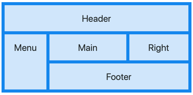
The CSSGridItem is used to define sections within the Grid. CSSGridItems can be combined to make irregular sections in the CSSGrid. In the above example, the top row of the CSSGrid has been merged into a single control called Header.
The CSSGridItem control can be used as a wrapper for other controls you have set up in your project. Add them to the Design Screen as usual, then right click in a CSSGridItem and use Add Child. The control will then move into the CSSGridItem. If you reposition the CSSGrid, the included controls ("children") will move with it. Use right click Remove Child to take a child out of a CSSGrid.
CSSGridItems can contain other CSSGrids.
To add a CSSGridItem control to your app, choose the CSSGridItem icon in the Toolbox, then position it on the Design Screen. Use the Property Editor to set the properties you need. Right click in the CSSGridItem to add children.
At runtime, controls can be added as children to the CSSGrid or CSSGridItems using the addChild() function: CSSGrid.addChild(Button1).
Here are some useful resources for learning more about using CSSGrid:
- https://www.w3schools.com/css/css_grid.asp
- https://css-tricks.com/snippets/css/complete-guide-grid/
- https://developer.mozilla.org/en-US/docs/Web/CSS/CSS_Grid_Layout
Properties
CSSGridItem Properties
| gridArea | Name for the area. Use in CSSGrid's gridTemplateAreas property. |
| gridColumnStart | Specifies a grid item’s start position within the grid row. Examples: auto, 3, -1, span 2 |
| gridColumnEnd | Specifies a grid item’s end position within the grid row. Examples: auto, 3, -1, span 2 |
| gridRowStart | Specifies a grid item’s start position within the grid row. Examples: auto, 3, -1, span 2 |
| gridRowEnd | Specifies a grid item’s end position within the grid row. Examples: auto, 3, -1, span 2 |
Other Properties
Standard properties are supported, plus:
| addChild(control) | control is added to the Control. Runtime. |
| attributes | A list of HTML attributes. To prevent jQuery Mobile from styling the element, use data-role=none. Attributes are separated by spaces. Design time. |
| center | Centers the contents, horizontally and vertically. Only works if HTMLTag is 'div'. |
| class | List of CSS classes to apply to the element. Class names are separated by spaces. Design time. |
| content | The text to use in between the HTML tags. Can be text or HTML. Design time. At runtime, use .innerHTML. |
| innerHTML | The text to use in between the HTML tags. Can be text or HTML. Run time. At Design Time,, use content. |
| position | How children positioned. Default is 'relative': elements are positioned relative to each other and the size of the CSSGrid. With 'absolute', controls are positioned within the CSSGrid set by width and height. Other options are 'fixed' and 'static'. Design time. |
| style | A list of style properties, each in the form styleName:value; Example: "height:40px; width:100px".Design time. |
Events
Standard events are supported.
