Pagination (Bootstrap): Difference between revisions
Jump to navigation
Jump to search
| Line 16: | Line 16: | ||
| addItem(''item'', ''type'') || Adds an ''item'' to the end. ''type'' can be "active" or "disabled" . Runtime. | | addItem(''item'', ''type'') || Adds an ''item'' to the end. ''type'' can be "active" or "disabled" . Runtime. | ||
|- | |- | ||
| clear || Clears all items. Runtime. | | clear() || Clears all items. Runtime. | ||
|- | |- | ||
| items || Items to show, one per line. Prefix * for disabled, > for selected, ! for heading (not all controls support headings). Design Time. | | items || Items to show, one per line. Prefix * for disabled, > for selected, ! for heading (not all controls support headings). Design Time. | ||
Revision as of 14:43, 24 February 2019
Description
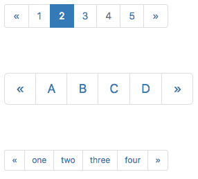
Provide pagination links for your site or app with the multi-page pagination component.
When list of items is supplied at Design Time, the left and right arrows are supplied automatically. To add arrows at runtime, use « and » as the text in addItem().
Popovers and Tooltips are supported.
Properties and Methods
Standard properties are supported, plus:
| addItem(item, type) | Adds an item to the end. type can be "active" or "disabled" . Runtime. |
| clear() | Clears all items. Runtime. |
| items | Items to show, one per line. Prefix * for disabled, > for selected, ! for heading (not all controls support headings). Design Time. |
| length | Current number of items. Runtime. |
| value | Get and set the active tab. Runtime. |
Events
Standard events are supported. For this control, the onclick event will be most useful.
Example (Basic)
Function Pagination1_onclick(choice)
  MsgBox "Item clicked: " & choice
End Function
Example (JavaScript)
Pagination1.onclick = function(choice) {
    NSB.MsgBox("Item clicked: " + choice);
};
