JqxChart
Description
jqxChart is an easy to use chart widget based on the popular jQuery library.
jqxChart supports several common chart types. You can easily plot series of different types on a common chart. A type must be specified for each series group. Currently jqxChart supports the following series types:
- column - simple column series
- stackedcolumn - stacked column series
- stackedcolumn100 - percentage stacked columns
- line - simple streight lines connecting the value points
- stackedline - stacked lines
- stackedline100 - percentage stacked lines
- spline - smooth lines connecting the value points
- stackedspline - smooth stacked lines
- stackedspline100 - percentage stacked smooth lines
- area - area connecting the value points with streight lines
- stackedarea- stacked area with streight lines between the points
- stackedline100 - percentage stacked area
- areaspline - smooth area connecting the value points
- stackedareaspline - smooth stacked areas
- stackedareaspline100 - percentage stacked smooth area
- pie - circular chart divided into sectors, illustrating proportion
- scatter - data is displayed as a collection of points
- bubble - data is displayed as a collection of bubbles
Properties and Methods
See the complete documentation at jqWidget's site: http://www.jqwidgets.com/jquery-widgets-documentation/documentation/jqxcalendar/jquery-calendar-getting-started.htm
Example (JavaScript)
function Button1_onclick() {
  //Render the chart.
  $("#Chart2").jqxChart(Chart2_settings);
}

var  sampleData = [
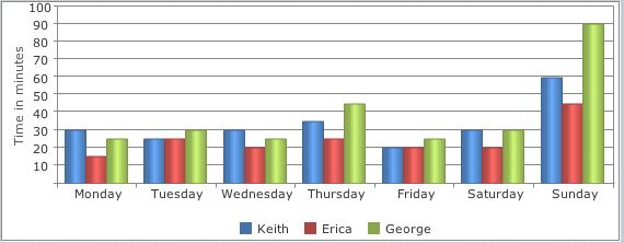
      { Day:'Monday', Keith:30, Erica:15, George: 25},
      { Day:'Tuesday', Keith:25, Erica:25, George: 30},
      { Day:'Wednesday', Keith:30, Erica:20, George: 25},
      { Day:'Thursday', Keith:35, Erica:25, George: 45},
      { Day:'Friday', Keith:20, Erica:20, George: 25},
      { Day:'Saturday', Keith:30, Erica:20, George: 30},
      { Day:'Sunday', Keith:60, Erica:45, George: 90}
  ];

Chart2_settings.source = sampleData;
Chart2_settings.categoryAxis = {
            dataField: 'Day',
            showGridLines: false};
Chart2_settings.seriesGroups =
        [
            {
                type: 'column',
                columnsGapPercent: 30,
                seriesGapPercent: 0,
                valueAxis:
                {
                    minValue: 0,
                    maxValue: 100,
                    unitInterval: 10,
                    description: 'Time in minutes'
                },
                series: [
                        { dataField: 'Keith', displayText: 'Keith'},
                        { dataField: 'Erica', displayText: 'Erica'},
                        { dataField: 'George', displayText: 'George'}
                    ]
            }
        ]
Example (BASIC)
Dim sampleData, row

Function Button1_onclick()
  'Render the chart.
  $("#Chart1").jqxChart(Chart1_settings)
End Function

Function Form1_onshow()
  sampleData = []
  For i=0 To 6
    row=[]
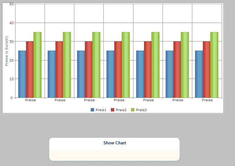
    row["id"] = "Preise"
    row["Preis1"] = 25
    row["Preis2"] = 30
    row["Preis3"] = 35
    sampleData[i]= row
  Next

  Chart1_settings.source = sampleData
  Chart1_settings.categoryAxis={dataField:"id", showGridLines:True}
  Chart1_settings.seriesGroups = [ _
    { _
    type: "column", _
    columnsGapPercent: 30, _
    seriesGapPercent: 0, _
          valueAxis: _
          { _
          minValue: 0, _
          maxValue: 50, _
          unitInterval: 10, _
          description: "Preise in Euro(€)" _
          }, _
            series:[ _
                    { dataField: "Preis1", displayText: "Preis1"}, _
                    { dataField: "Preis2", displayText: "Preis2"}, _
                    { dataField: "Preis3", displayText: "Preis3"} _
                    ] _
    } _
    ]

End Function
To resize a chart:
  Chart1.resize(100,100,600,400)
  $("#Chart1").jqxChart("refresh");

