Pagination (Bootstrap)
Description
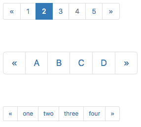
Provide pagination links for your site or app with the multi-page pagination component.
When list of items is supplied at Design Time, the left and right arrows are supplied automatically. To add arrows at runtime, use « and » as the text in addItem().
Popovers and Tooltips are supported.
Properties and Methods
Standard properties are supported, plus:
| addItem(item, type) | Adds an item to the end. type can be "active" or "disabled" . Runtime. |
| clear | Clears all items. Runtime. |
| items | Items to show, one per line. Prefix * for disabled, > for selected, ! for heading (not all controls support headings). Design Time. |
| length | Current number of items. Runtime. |
| value | Get and set the active tab. |
Events
Standard events are supported. For this control, the onclick event will be most useful.
Example (Basic)
Go through all the checkboxes and see which ones have been chosen.
Function Pagination1_onclick(choice)
  MsgBox "Item clicked: " & choice
End Function
Example (JavaScript)
Go through all the checkboxes and see which ones have been chosen.
Pagination1.onclick = function(choice) {
    NSB.MsgBox("Item clicked: " + choice);
};
