Input (Bootstrap)
Description
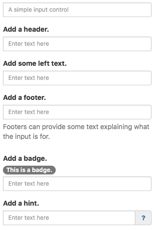
The Input control allows a single line of input text. It has optional headers, footers and other features.
Note that Input (Bootstrap) does not have .text property. Use .value to get the value of the control.
To disable an Input at runtime, do the following:
Input1_contents.disabled = true
To highlight an Input control with an error (and return it to normal):
  $("#Input1").addClass("has-error")
  $("#Input1").removeClass("has-error")
To hide and show the Help text:
  $("#Input1 .help-block").addClass("hidden")
  $("#Input1 .help-block").removeClass("hidden")
To respond to a click on the optional icon:
' BASIC
Function Input1_icon_onclick()

'JavaScript
Input1_icon.onclick = function() {
Popovers and Tooltips are supported.
Properties and Methods
Standard properties are supported, plus:
| autocapitalize | Automatically capitalize first letter? May not be available on other platforms. |
| autocomplete | Automatically complete words? May not be available on other platforms. |
| autocorrect | Spellcheck as entering? May not be available on other platforms. |
| badge | Adds a Badge to the control. Design Time and Runtime. |
| disabled | If true, grays out the input area and prevents changes. Design Time and Runtime. |
| files | Array of files chosen if inputType is 'file'. Runtime. |
| focus() | Sets the focus to the TextBox. Runtime only. |
| footer | An optional message at the bottom of the list of items. Design Time and Runtime. |
| header | An optional message at the bottom of the list of items. Design Time and Runtime. |
| headerCols | Width to be allocated to the header. Can be from 0 to 12. Default is 2. headerCols + valueCols must equal 12. |
| icon | An optional icon to appear at the right of the input field. Design Time and Runtime. |
| inputType | Specifies what kind of data will be input. Choices are color, date, datetime, email, file, hidden, month, number, password, range, search, tel, text, time and url. Default is text. Not all browsers support all types. Design time. |
| leftText | Text to appear in the left side of the input box. Does not display if container < 768 pixels. |
| max | If inputType is numeric, the maximum allowed value. For date, the latest date in the format YYYY-MM-DD. |
| maxlength | Maximum number of input characters. Does not apply to numeric: use max instead. |
| min | If inputType is numeric, the minimum allowed value. For date, the earliest date in the format YYYY-MM-DD. |
| placeholder | Text to be displayed in the field just as a comment – does not change the value. |
| readonly | If set to “True”, the control cannot be edited. At runtime, use readOnly. |
| required | If set to “True”, the field requires a value when the form is submitted. Design time only. |
| setSelectionRange(start, end) | Selects a range of characters. The first character starts at 0. Runtime only. Input1_contents.setSelectionRange(2,4) |
| size | Size of input text: small or large. Header and footer size is controlled by fontSize. Design time only. |
| spellcheck | Check spelling and grammer? |
| value | Gets or sets the value (true or false) of line i. Runtime. |
| valueCols | Width to be allocated to the value. Can be from 0 to 12. Default is 10. headerCols + valueCols must equal 12. |
Events
Standard events are supported. For this control, the onfocusout event will be useful. It gets called when the user changes the focus to another field.
Example (Basic)
Call a function when user is done editing field.
Function Input1_onfocusout()
  MsgBox "Value is " & Input1.value
End Function
Example (JavaScript)
Call a function when user is done editing field.
Input1.onfocusout = function() {
    NSB.MsgBox("Value is " + Input1.value);
};
